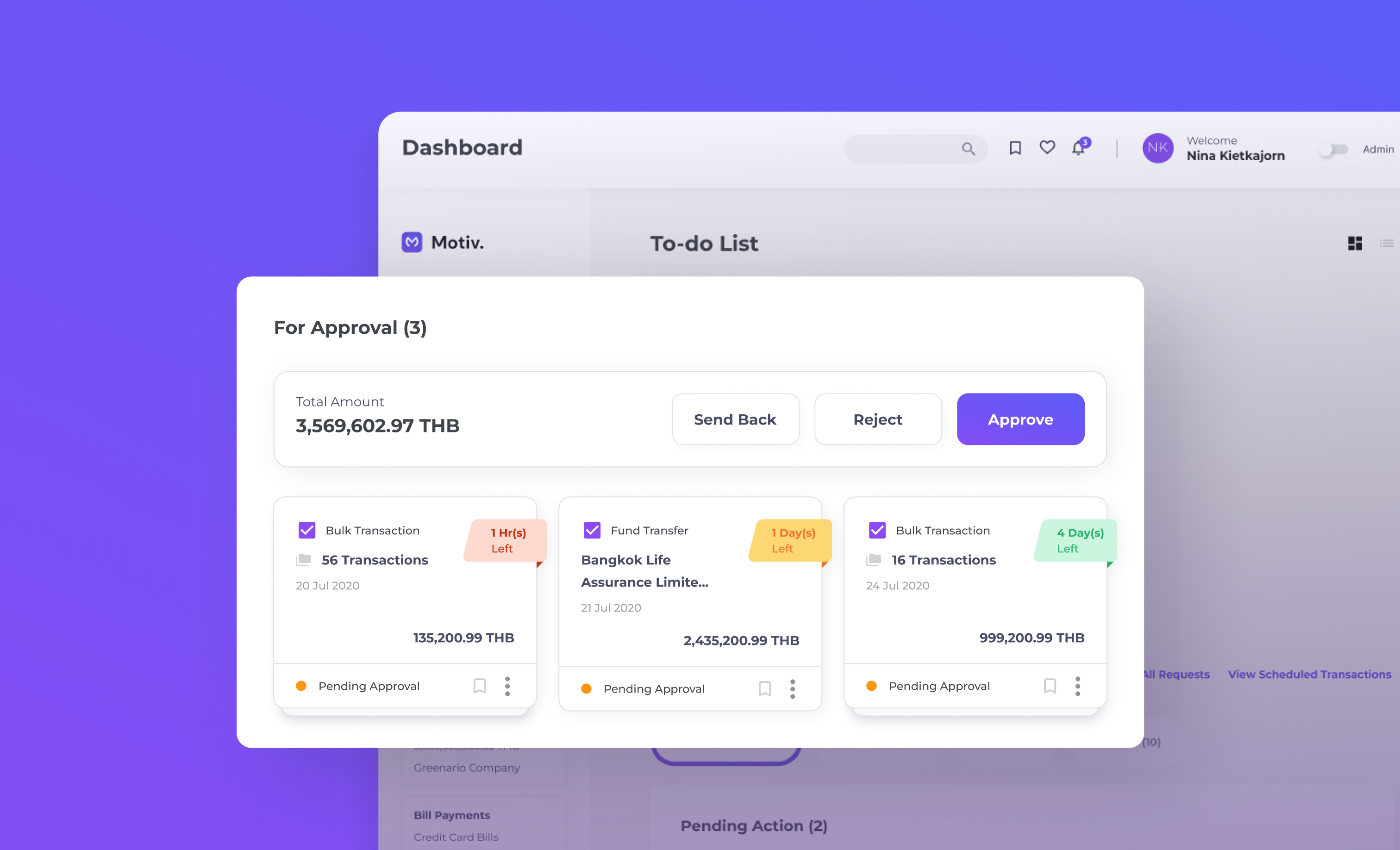
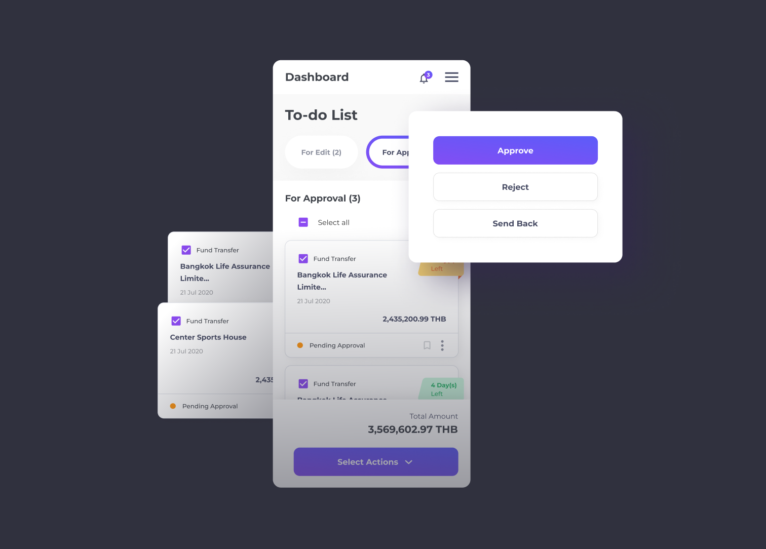
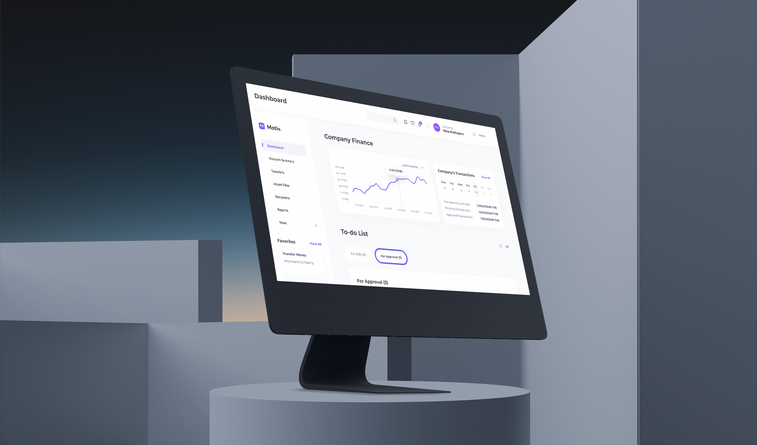
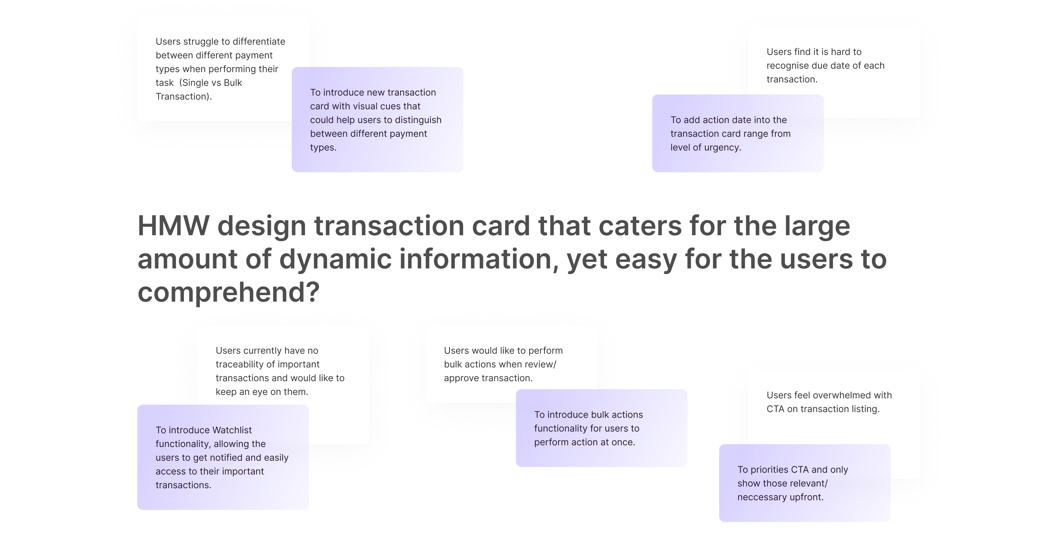
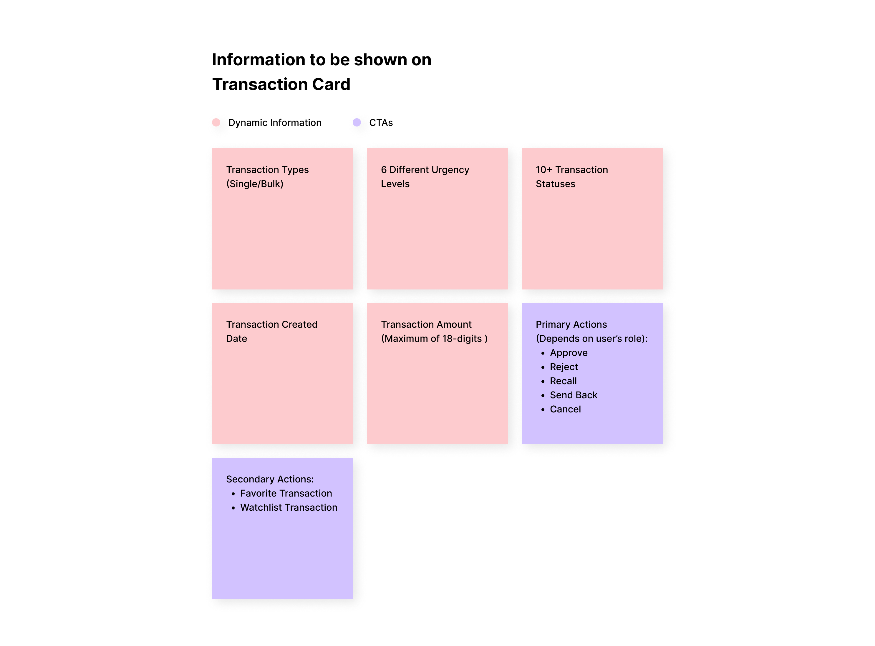
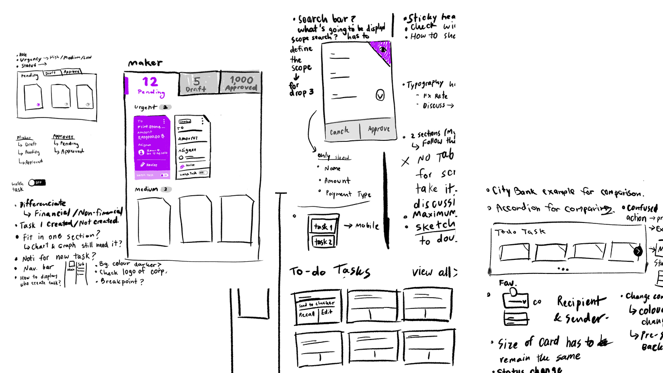
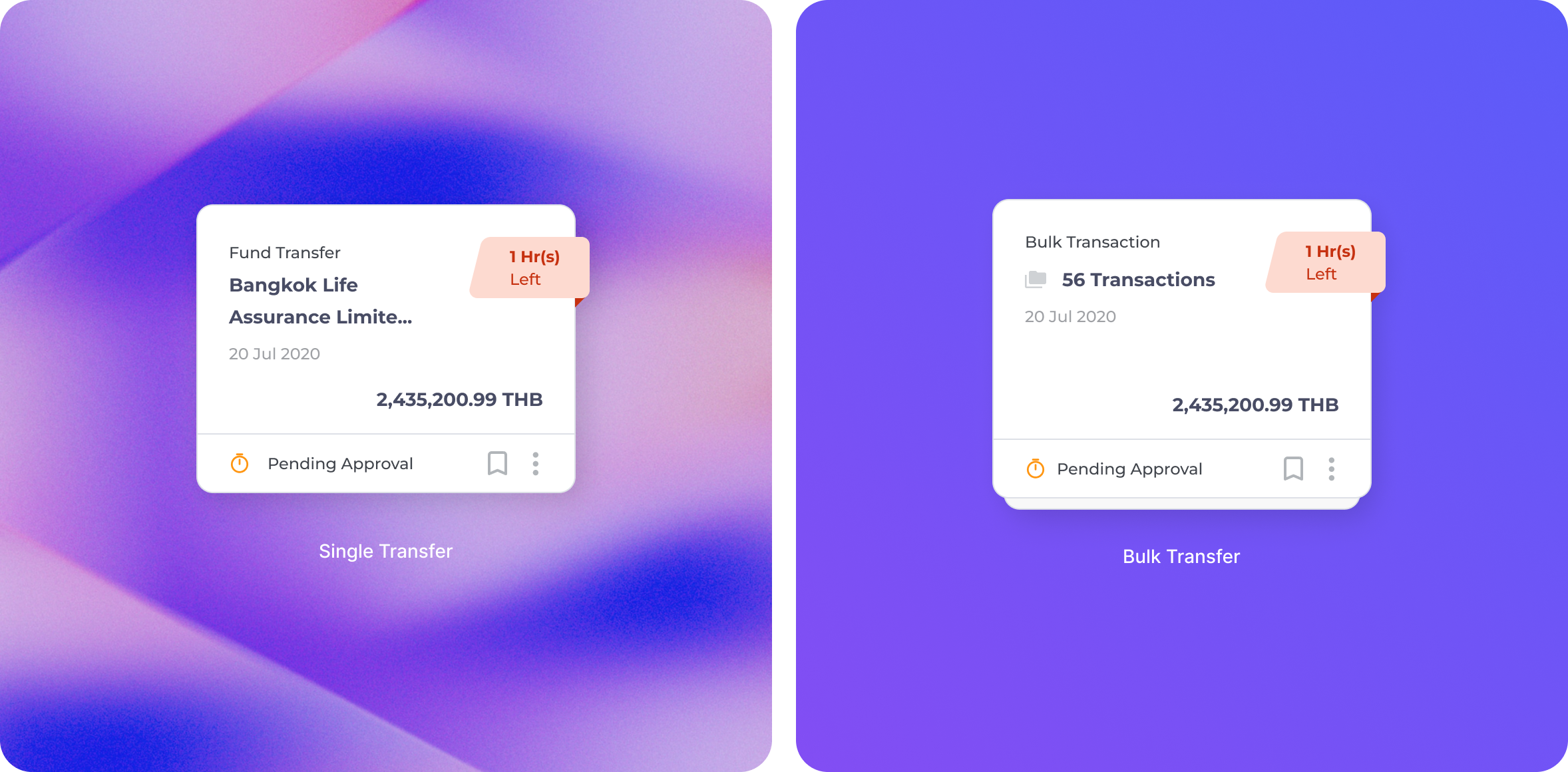
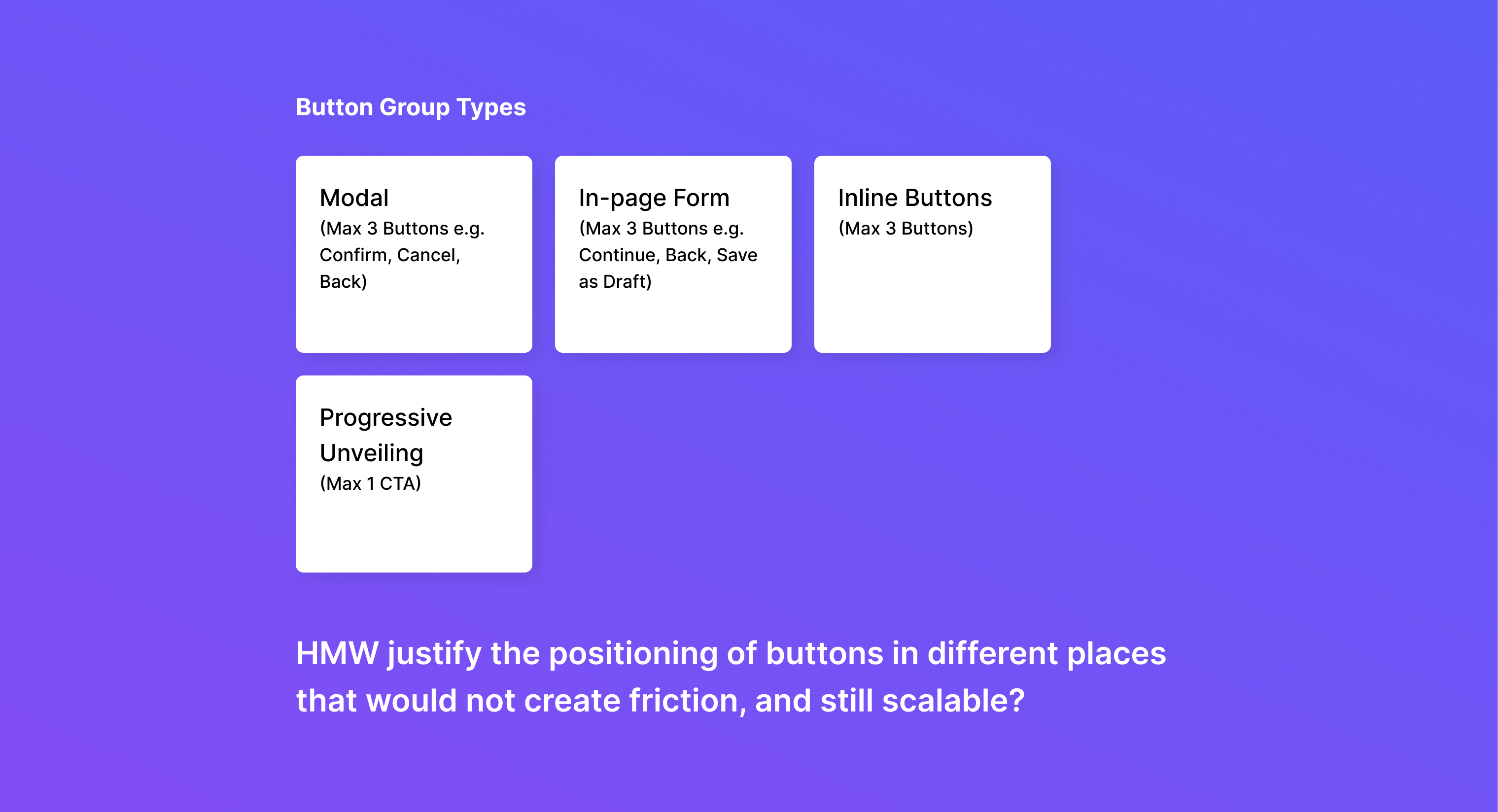
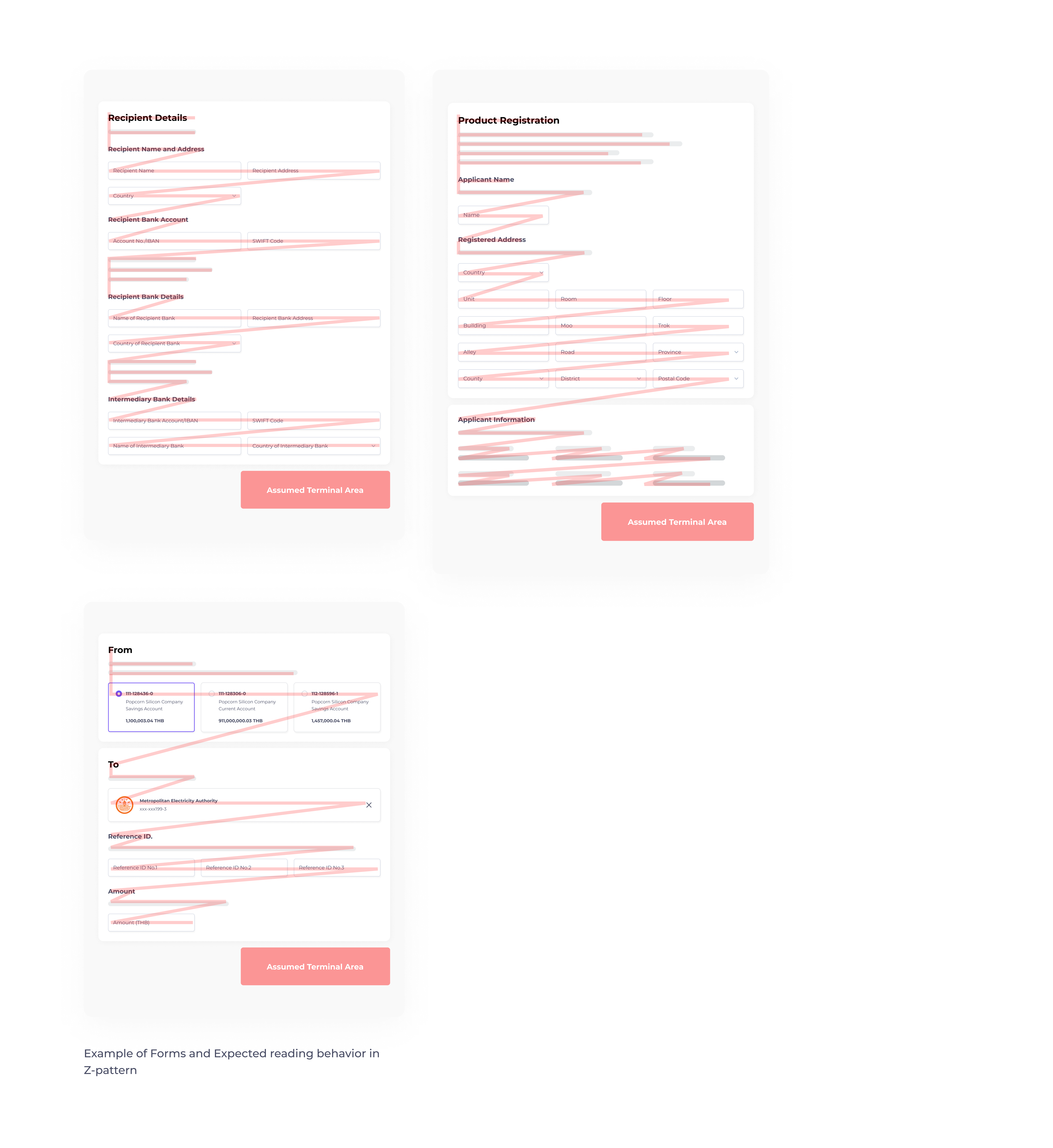
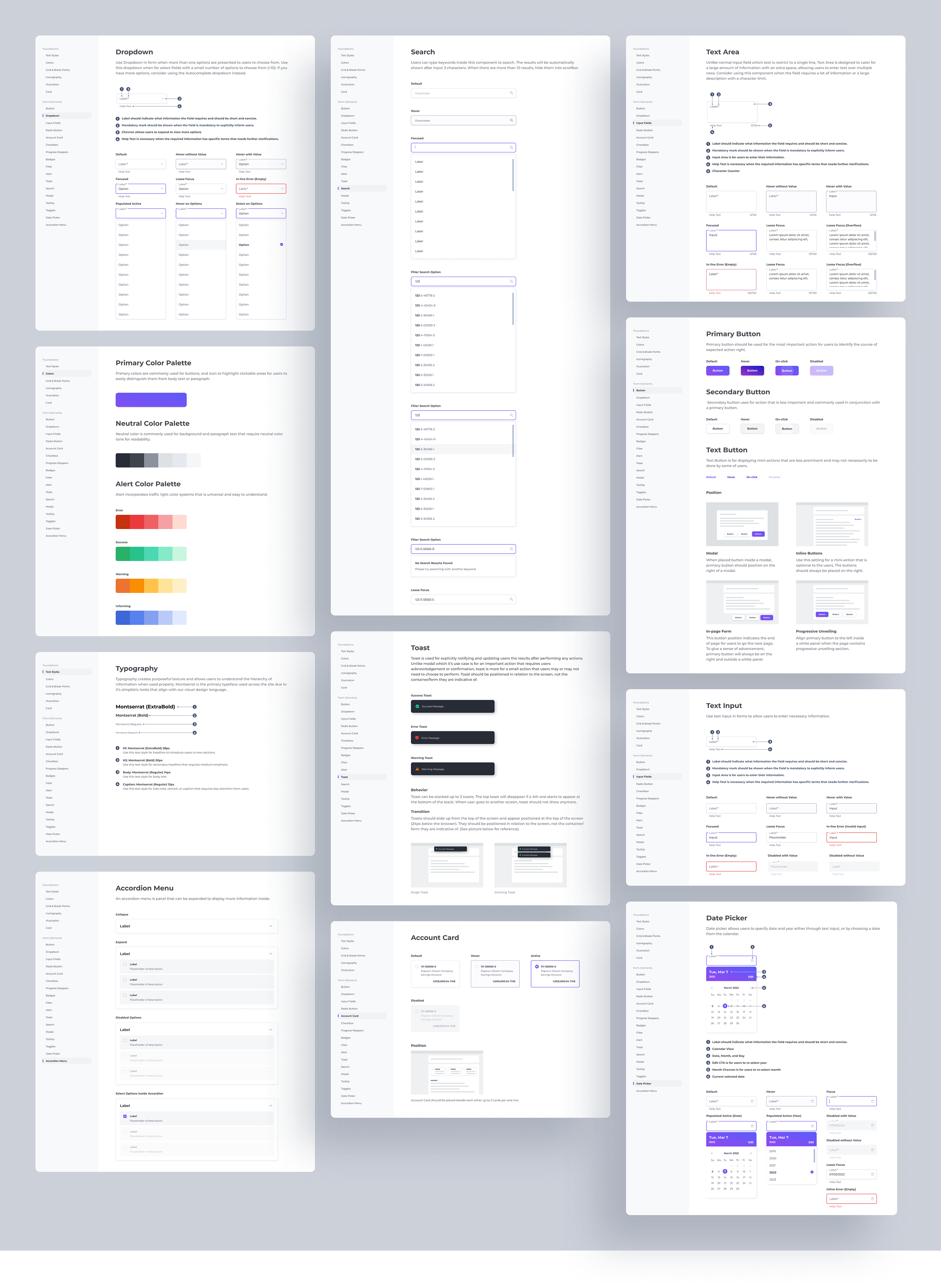
re-imagine experience of corporate banking platform

Year

2021 - 2020

overview

Worked in a cross-functional team from discover to implementation phrases to deliver an end-to-end UX/UI solutions for corporate banking platform.

services

UX/UI Design
Design System
Wireframe
Customer Journey
User Research

client

Leading Financial Institution in Thailand

Work under
Accenture Solution. Co., Ltd.

role

UX/UI Designer
(Design System Squad)

Suffer from tedious corporate banking processes, and incomplete experience, the clients as well as their users seek the platform that can eliminate those pain points, allowing them to complete their financial tasks more efficiently in a long run.

Solution

To reimagine the platform experience, user research had been conducted with the existing customers from different backgrounds and perspectives to understand their needs and journeys, before translating them into actionable items.

After several usability testing, the customers and their users can now enjoy better financial tasks and statuses managements with built-in intelligent payment products recommender, allowance for self-assistance, and administration.

visual design

New Component Library & Visual System of Corporate Banking

'Inconsistency' is one of the key concerns of the existing platform based on heuristic evaluation and user research. To tackle such a problem, I have worked together with Design System Squad to establish and ensure component used across the site remains consistent.

Since all of the component's behaviour, look and feel, as well as its use case scenario are pre-defined from the beginning, it is not only help to align the understanding of each party involved in the project, but also mean more efficient to developer and designer team as the components are pre-made and ready to be bought to use whenever is required.

design system challenge 1

Re-think The New Transaction Card Design

Upon conducting Heuristic Evaluation, and Users Interview on the existing site, transaction listing is found to be problematic and displays several usability issues as presented below.

Having identified the problem, the next step is we need to know how much information will potentially be shown inside the transaction card. All of the possible information is listed and discussed across the design squads as shown below.

By working collaboratively with other squads, we have tried different versions of transaction cards to make sure all of the use cases are covered.

design system challenge 2

Establish Bulk Action Design Pattern

Now that the new transaction card design is settled, we then started to look at this component as a whole, and scale them into the larger design patterns. This is when we started to explore the way to introduce a bulk action functionality.

Working across the entire design squad, we identified 2 possible solutions to perform bulk action and listed down the pros and cons of each to justify the design.

After careful consideration, we decided to move forward with Enabling/Disabling Design Pattern for easy discovery. Additionally, the assertive text is added as a guideline to make sure the users are fully acknowledged on how to activate/inactivate bulk action.

Having defined transaction card and its design pattern, we then expand them further into different variants to cover all of the use cases and user flows.

design system challenge 3

Re-positioning of The Button Group

As several types of forms and use cases are introduced to the new platform, the site is prone to create friction and overwhelm users with an inconsistent placement of CTAs.

To avoid such an issue, the DS squad needs to establish the universal rule of button groups used across the site. Working together with other designer squads, we identified button groups in 4 main types based on the usage.

In-page Form Button Group

I started by defining the position of the In-page Form Button Group first, as they are being used mostly across the site. The fact that some forms come with Progressive Unveiling mechanic makes it more challenging, as I need to ensure that users are able to identify which button triggers which actions without confusing them (e.g. progress to the next page VS progress to the section below within the same page). Being able to identify them would be a stepping stone to the others.

To identify the most proper position, I collected several form layouts from different squads and justified them by referring to the attention-flow pattern. As the majority of the content flows from left-right and almost occupies full-width spacing, users are expected to read in Z-pattern which makes the assumed terminal area in the lower right.

Hence, I proposed buttons should be put in the lower right as:
1. It is the area where the users need to take action.
2. it reinforces the conceptual sequence of progressing to the next step for the In-form Button Group.

progressive unveiling Button Group

Unlike In-page Form, Progressive Unveiling Button Group is put on the bottom left inside the card. This is to avoid confusing them with In-page Form Button Group, as their behaviors are completely different.

modal Button Group

Following the logic of right alignment, I concluded that the button group of Modal should be put on the right to keep the experience consistent with those of In-form Button Group.

inline Button Group

Inline Button Group represents sub-actions that relate to the component it's nestled with. Hence, I propose these button groups should position on the right beside their main components. This is to provide users with the action at the point when they're needed.

Example of Some Design System Documentation

Key Takeaway

For the first time in my career life that I have had an opportunity to run Design System on such a huge scale and work with Creative technologist. I learned a lot, not only about Design System management but also a large-scale collaboration.