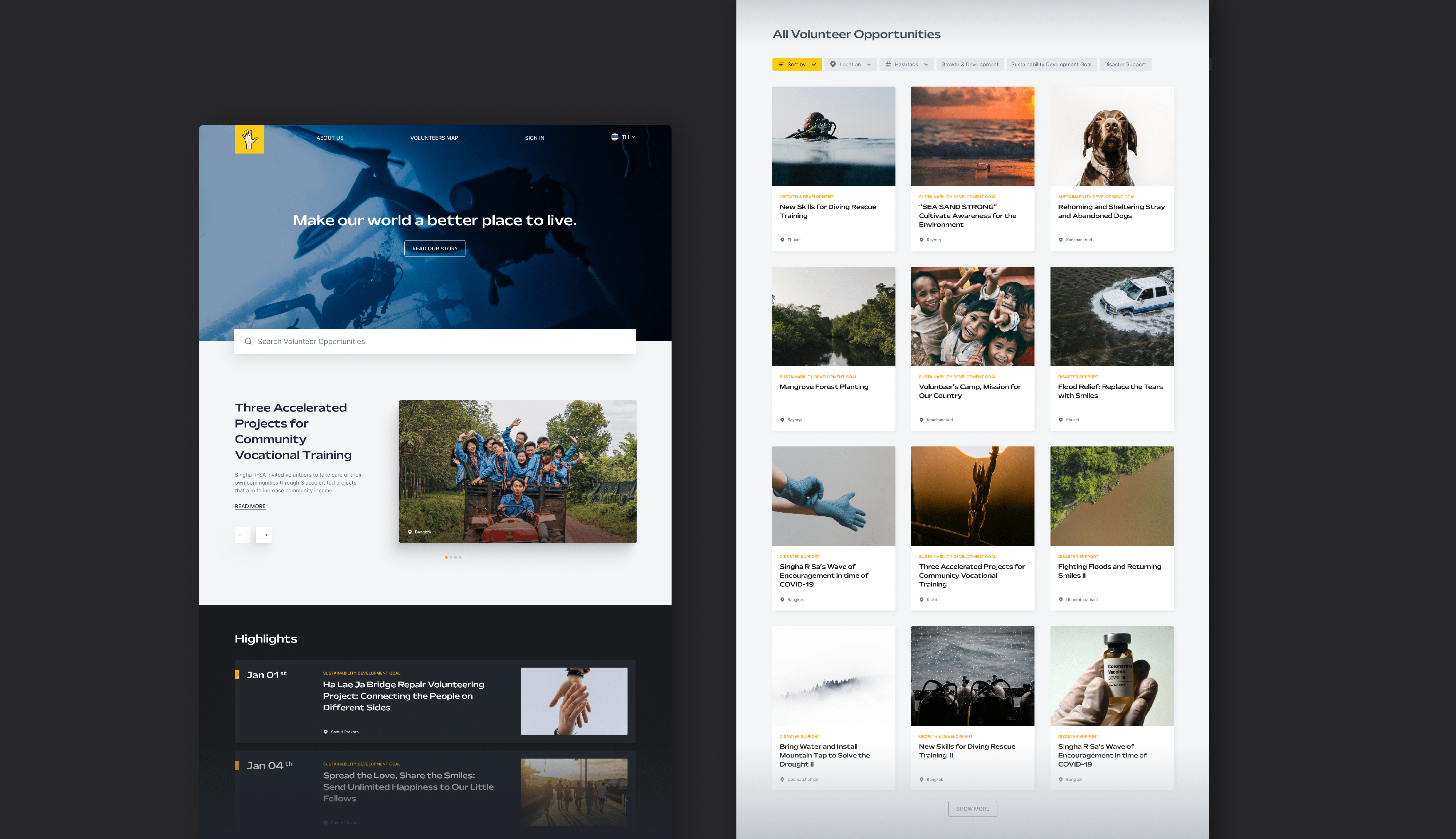
SINGHA R-SA:
digital platform for VOLUNTaRy OPPORTUNITies

Year

2022

overview

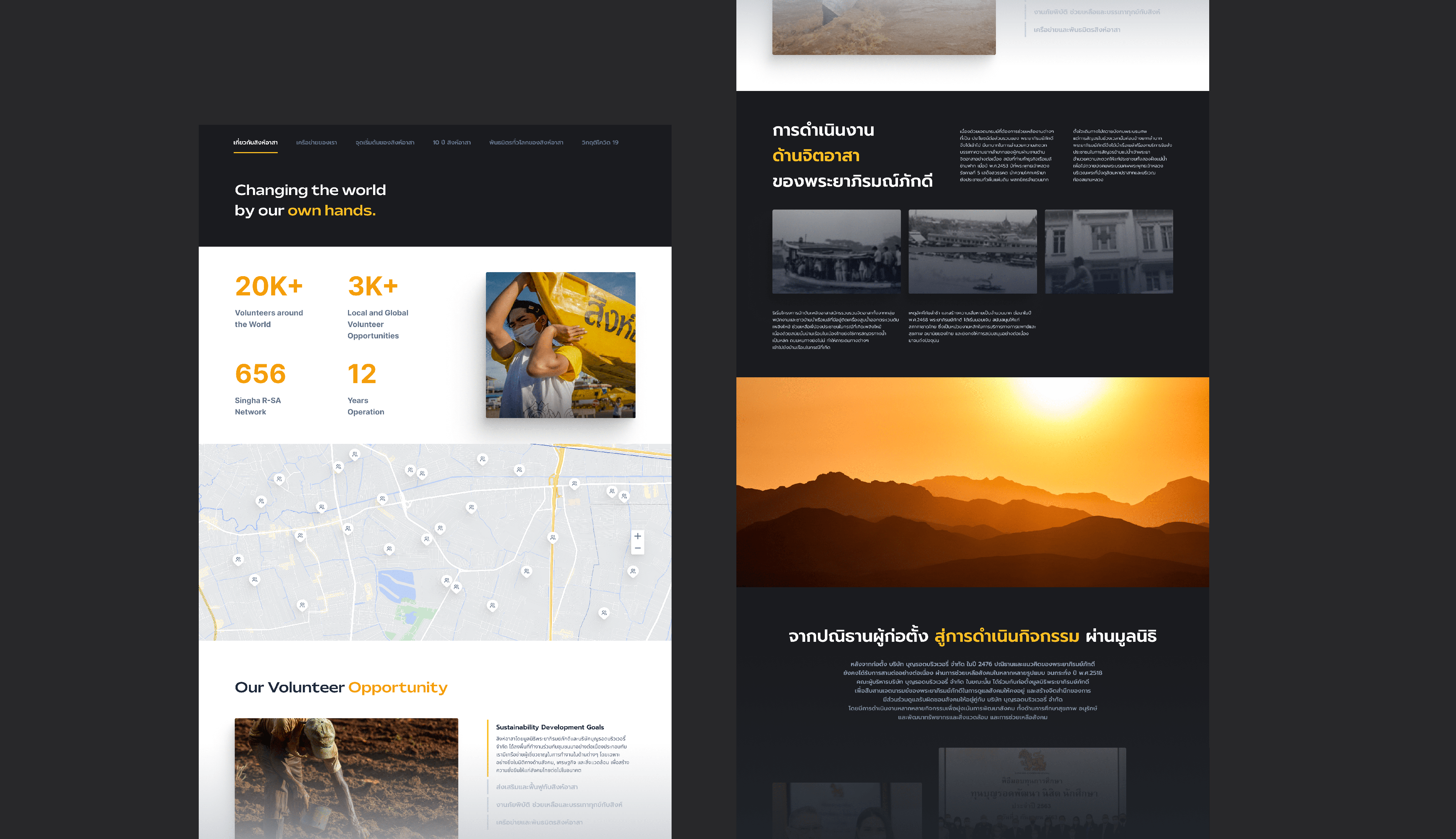
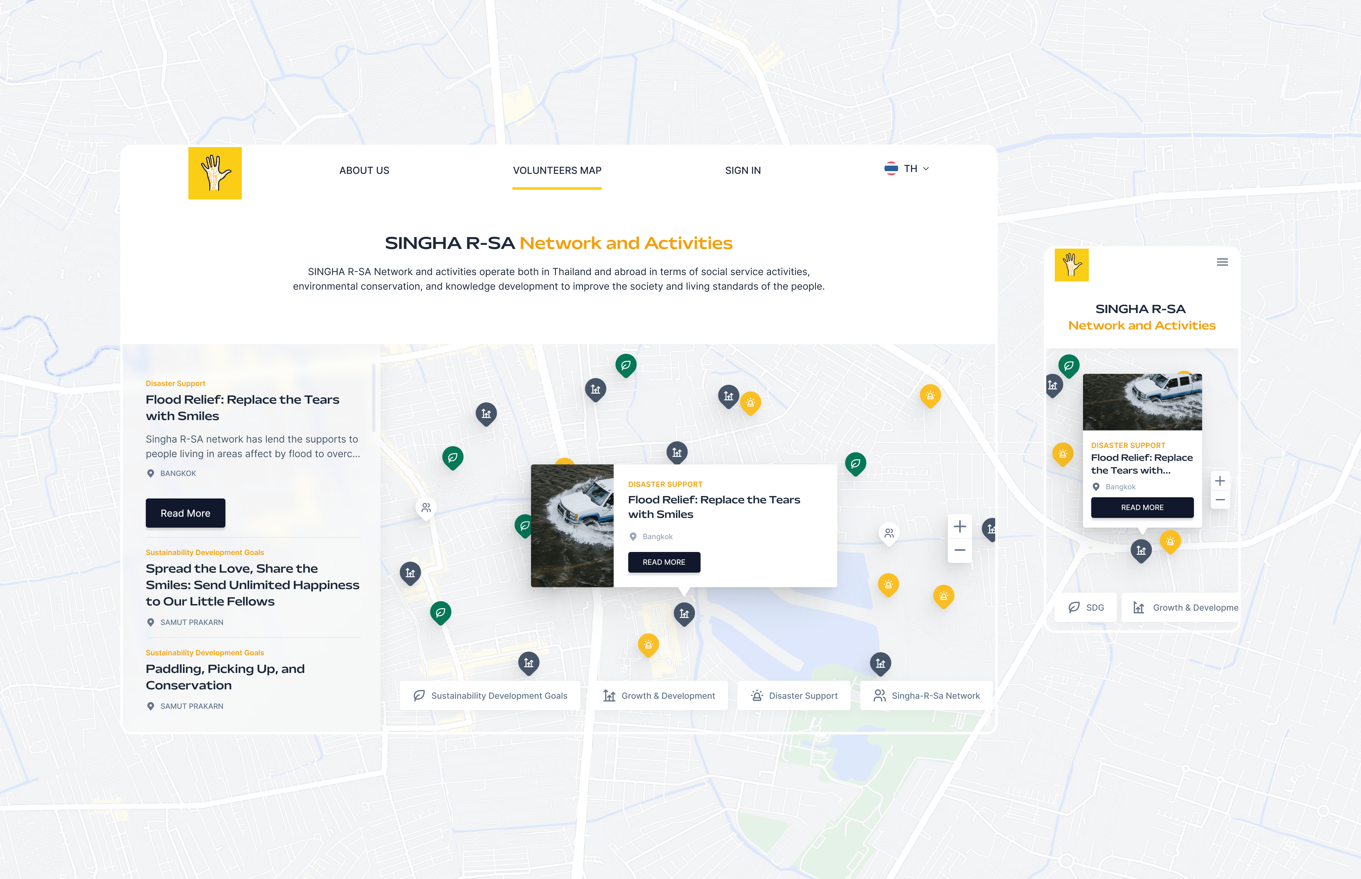
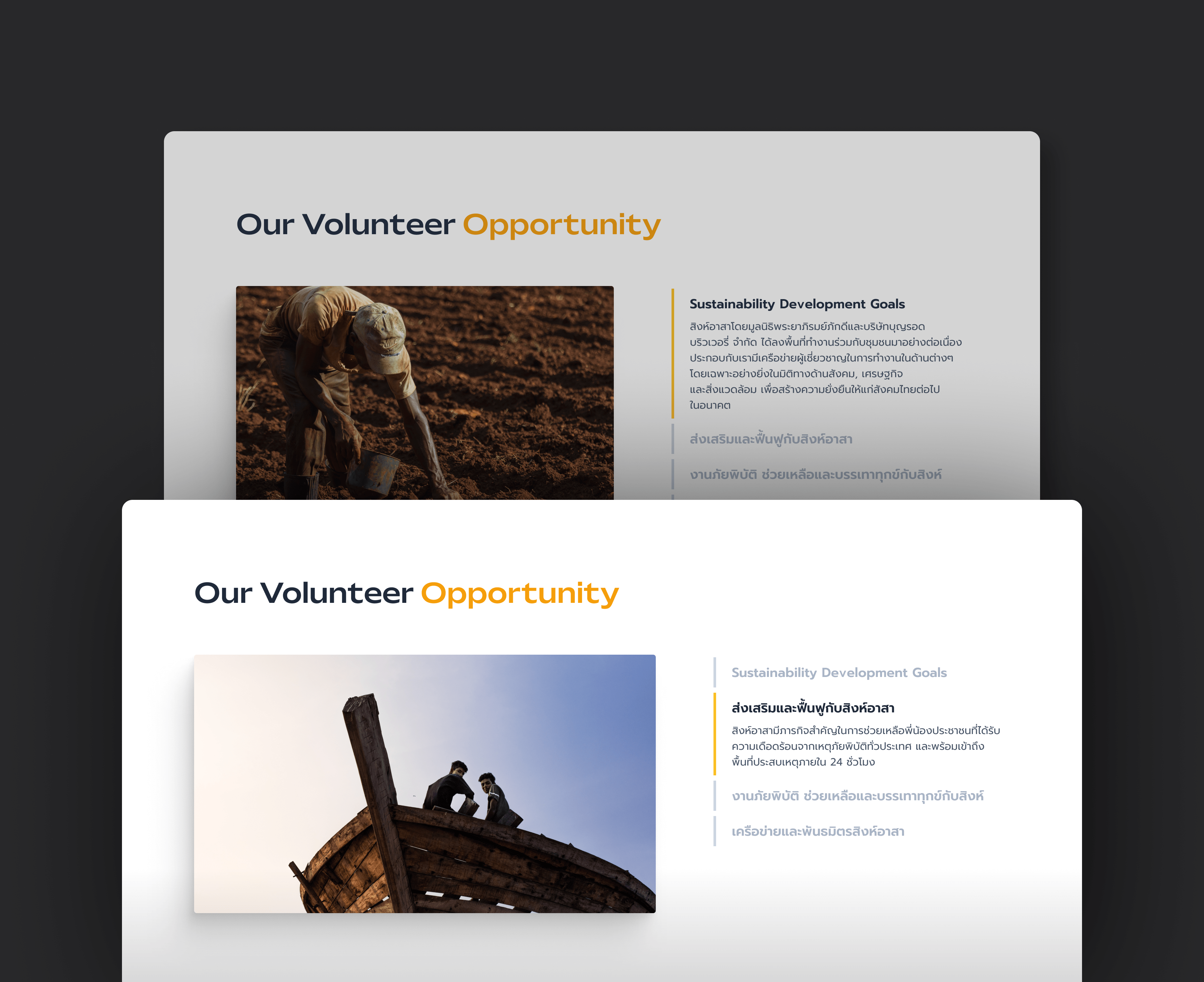
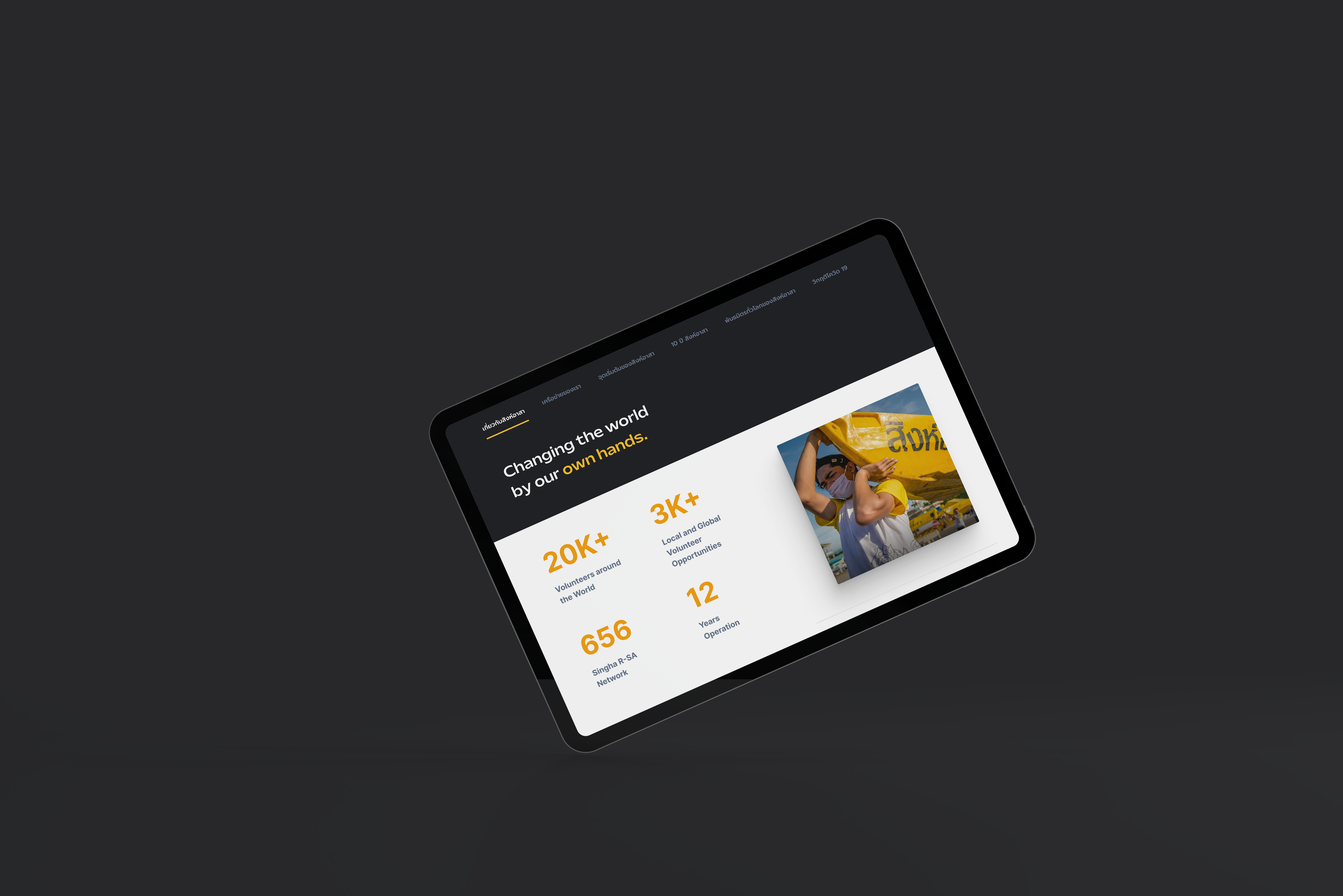
Aiming to attract more target users, I was asked to refresh Singha R-SA website look&feel and it's UX.

services

UX Audit
UX Design
Wireframe
Interface Design

client

Boon Rawd Brewery, Thailand

role

Lead UX/UI Designer

Founded by Boon Rawd Brewery, one of the largest and well-known beverage company in Thailand, Singha R-SA is the community aims to connect and provide volunteer opportunities to the young generations to contribute to societies.

challenge

Due to the outdated look that disconnected the platform from its target audience, I was asked to revamp the entire website.

Solution

Within a small team (2 Designers, 1 Project Manager, 2 Developers), I lead and manage design team to come up with visual design as well as UX design of this project by starting from conducting UX Audit with the existing site to identify usability issues and provide design solutions in both UX/UI to tackle such issues.

ux audit

Evaluates Issues on the Existing Site

An initial UX Audit was undertaken to identify design gaps and usability issues the users may face when using the existing platform. Such challenges are then turned into an opportunity to improve the user experience of the new site.

usability issues
01

Site Navigation Bar

Too much navigation menu leading to the same page which could cause decision constraints for the users to select and navigate through.

02

Landing Page

Content on Landing Page is cluttered and can be re-arranged to improve content hierarchy.

03

Searchability

Content is hard to discover as there is no search functionality, making it hard for users to find what they really want.

04

About us Page

Due to content length that cannot be reduced, the page is getting lengthy. Left no choices for the users to choose whether what content they would want to see/unseen.

05

Visual Design

Referring to the target users range from university students to first jobbers. The clients would like their site to be bolder and have more adventurous personality that speaks to those users.

key improvement 01

Establish the New Site Look & Feel

Typography and color palette is carefully selected to express Singha-R-Sa personality which is spontaneous and bold.

The site embraces a neutral color palette as a primary color for readability and embraces yellow as an accent color.

key improvement 02

The New Navigation Bar & Site Map

Using a redundant and too specific menu name could result in some navigating problems as users may do not know where they should click on to get to see what they want. To resolve the problem, I do as follows:
1. Grouped menus that are relevant together
2. Renamed them using a more generic word

This could reduce friction and allows Signha-R-Sa users to spend less time guessing on where should they click on.

UX wireframe

UX solutions are provided and communicate using medium-fidelity wireframe to get an agreement from both parties before transforming them into the actual design.

key improvement 03

Enhance The Ability to Skim & Scan Contents

Taking into consideration the nature of Singha R-Sa being a text-heavy site, the new interface is designed to cater for scannability.

Such design could ease the users while browsing through the site, regarding the fact that users rather skim through contents rather than going through them line-by-line to find what they want to see.

content visibility

Contents are breakdown into 3 distinct sections for users to easily digest information and identify content types e.g. Highlight VS Normal Section.

Tag & Filter

To ease users’ efforts of finding desired information, Tags and Filter functionality are implemented into the site. The users can now choose to filter information via location, hashtags, or activity types, taking full control of what they want or do not want to see.

key improvement 04

Improve Content Searchability

Without a proper search functionality, users could spend huge amount of time and efforts looking for what they want, resulting in more drop off rate.

To tackle such pain, the new Singha R-Sa site offers a Geolocation-based Navigation Map and Search functionality for the contents to be easily accessed right away.

Geolocation-based Navigation Map

Apart from improving a traditional text-oriented search bar, Geolocation-based Navigation Map is also introduced as another alternative for searching any volunteer activities. Such a map provides a holistic view of Singha R-Sa activities around Thailand.

As a result, it eases users who are looking for any volunteer activities around their neighborhoods or in a certain area to access such content faster and easier.

key improvement 05

Simplify Complexity & Reduce Cognitive Loads

To avoid users from being bombarded with a sheer volume of information, Singha R-Sa new site embraces Progressive Unveiling mechanic using components such as Navigation Tabs, and Accordion to only show information that is relevant to the users.