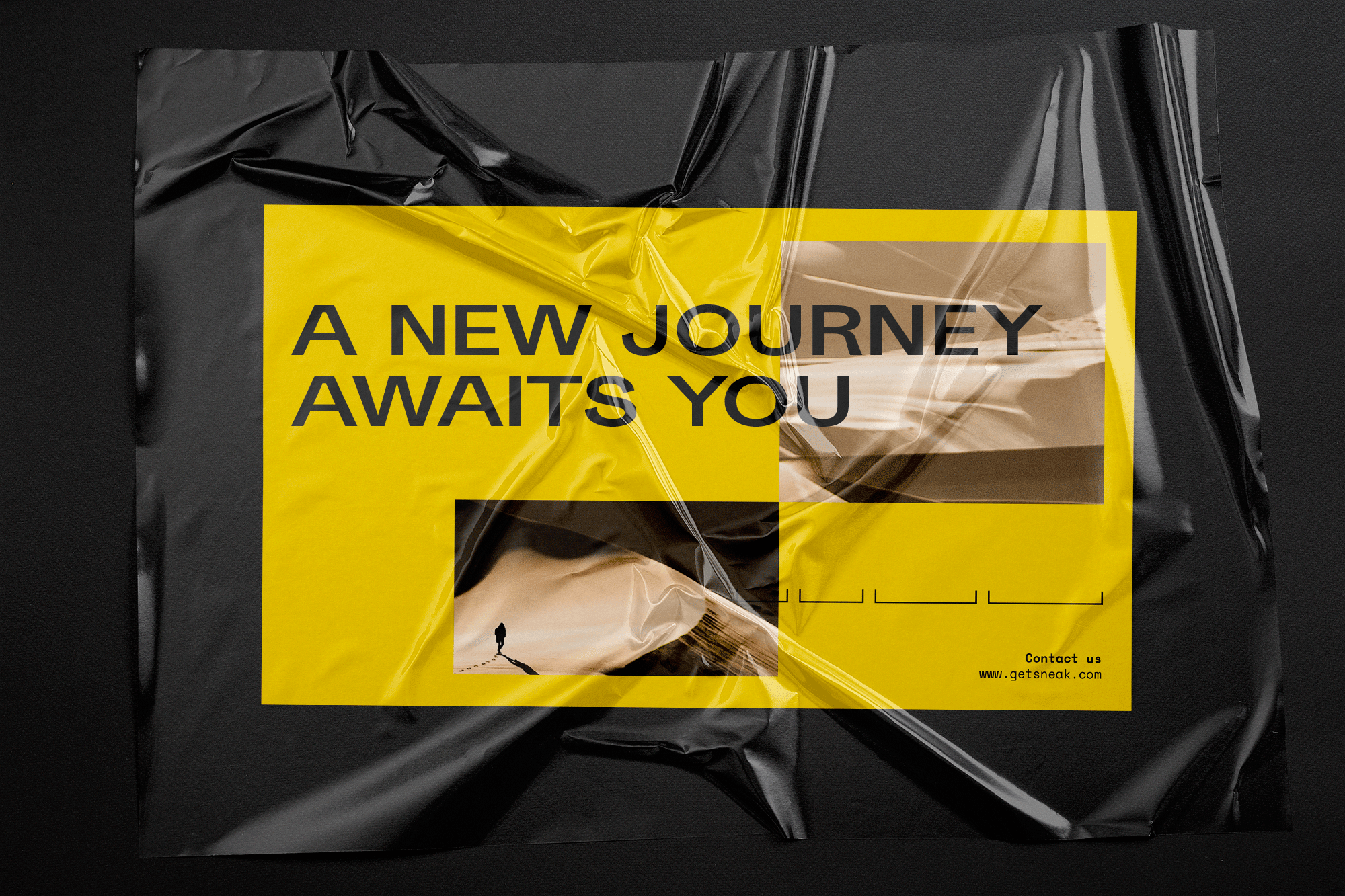
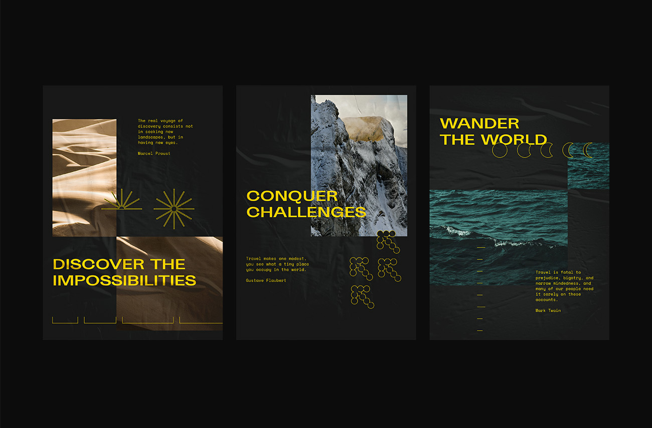
The Visual-based Trip Curator Platform for the New Generations
Year
2018 - 2020
overview
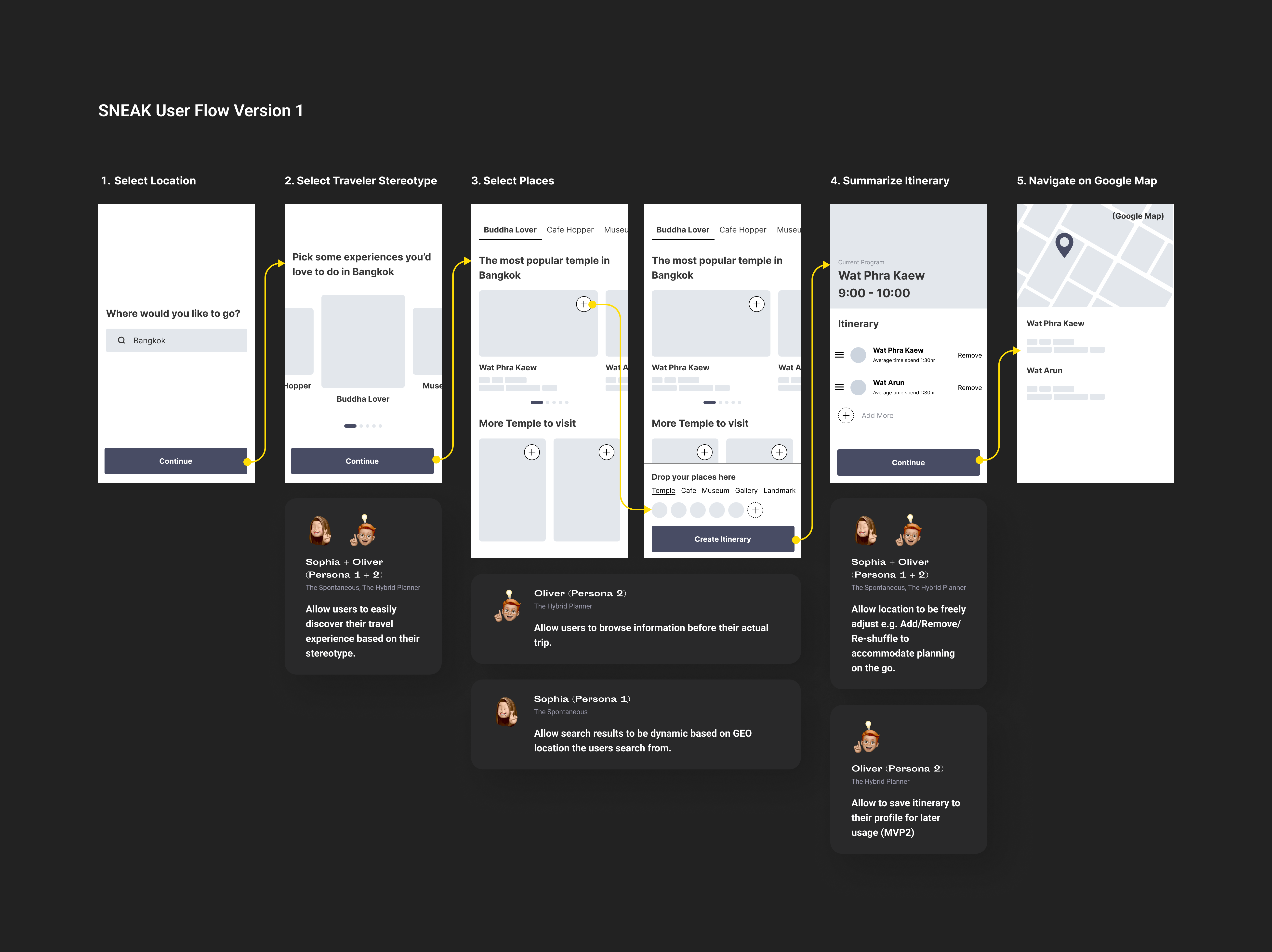
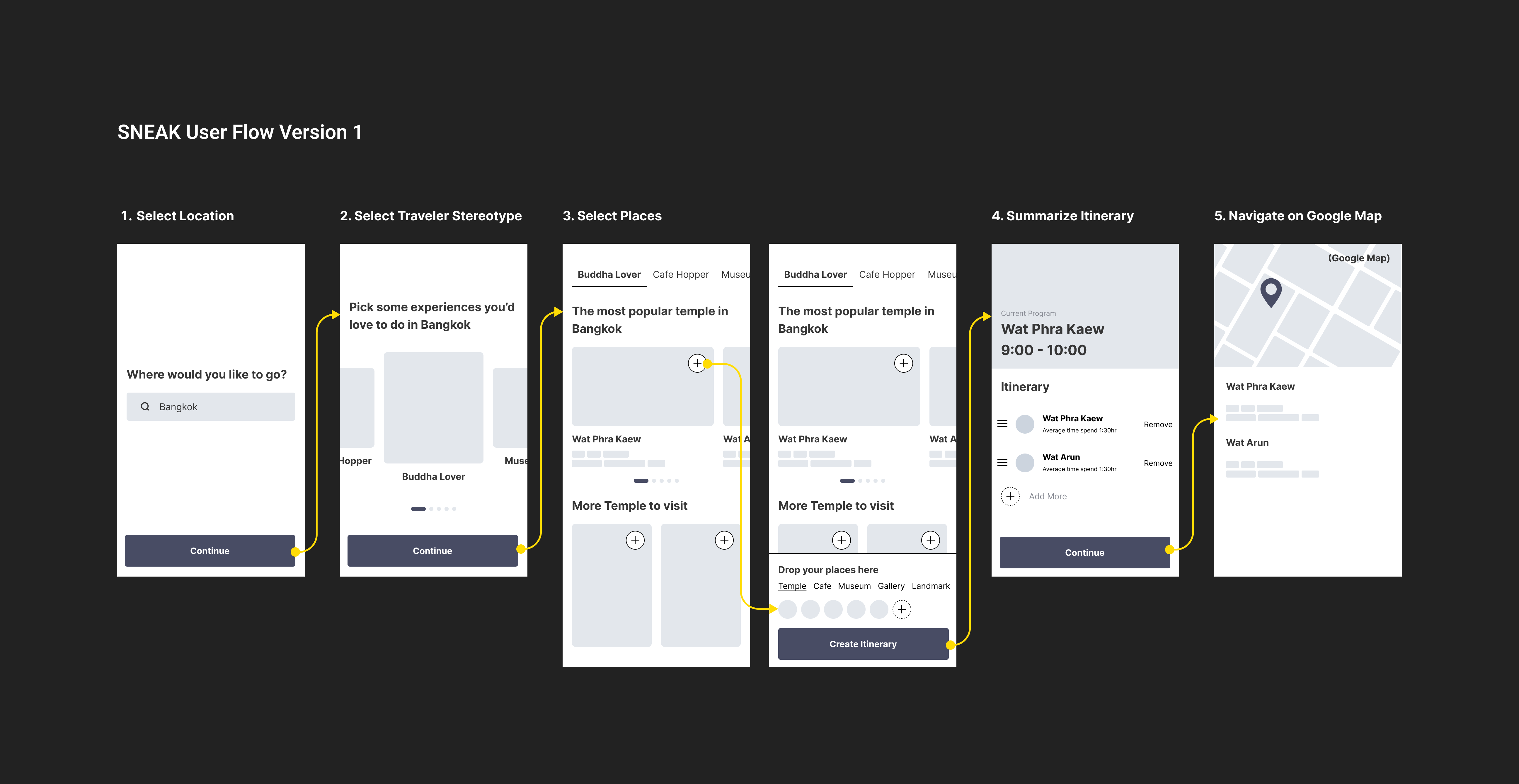
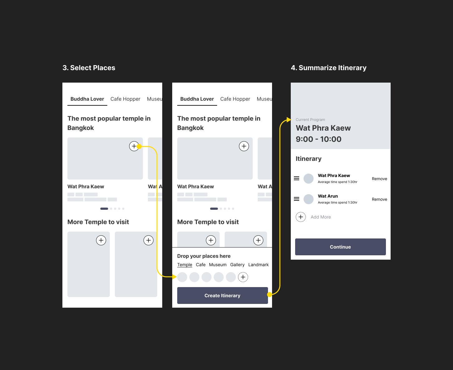
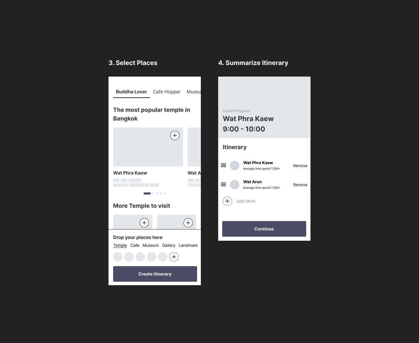
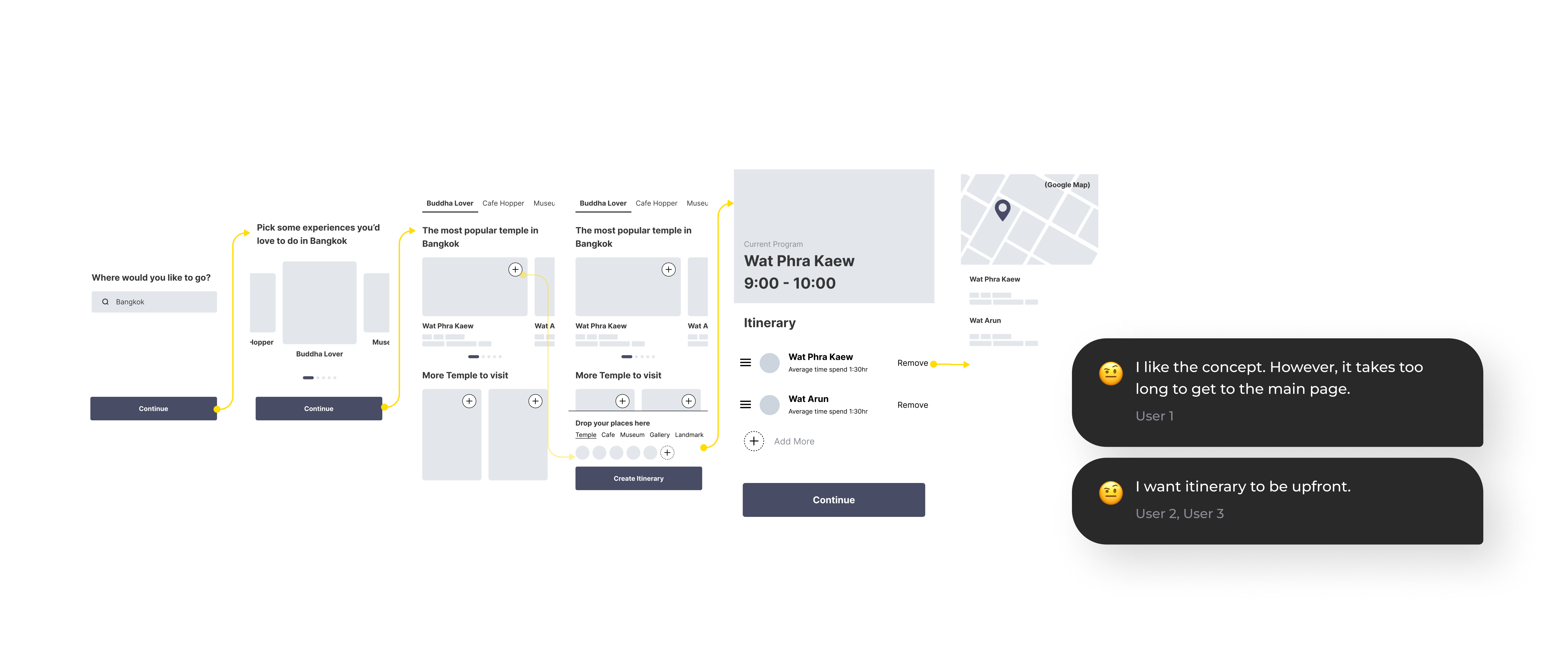
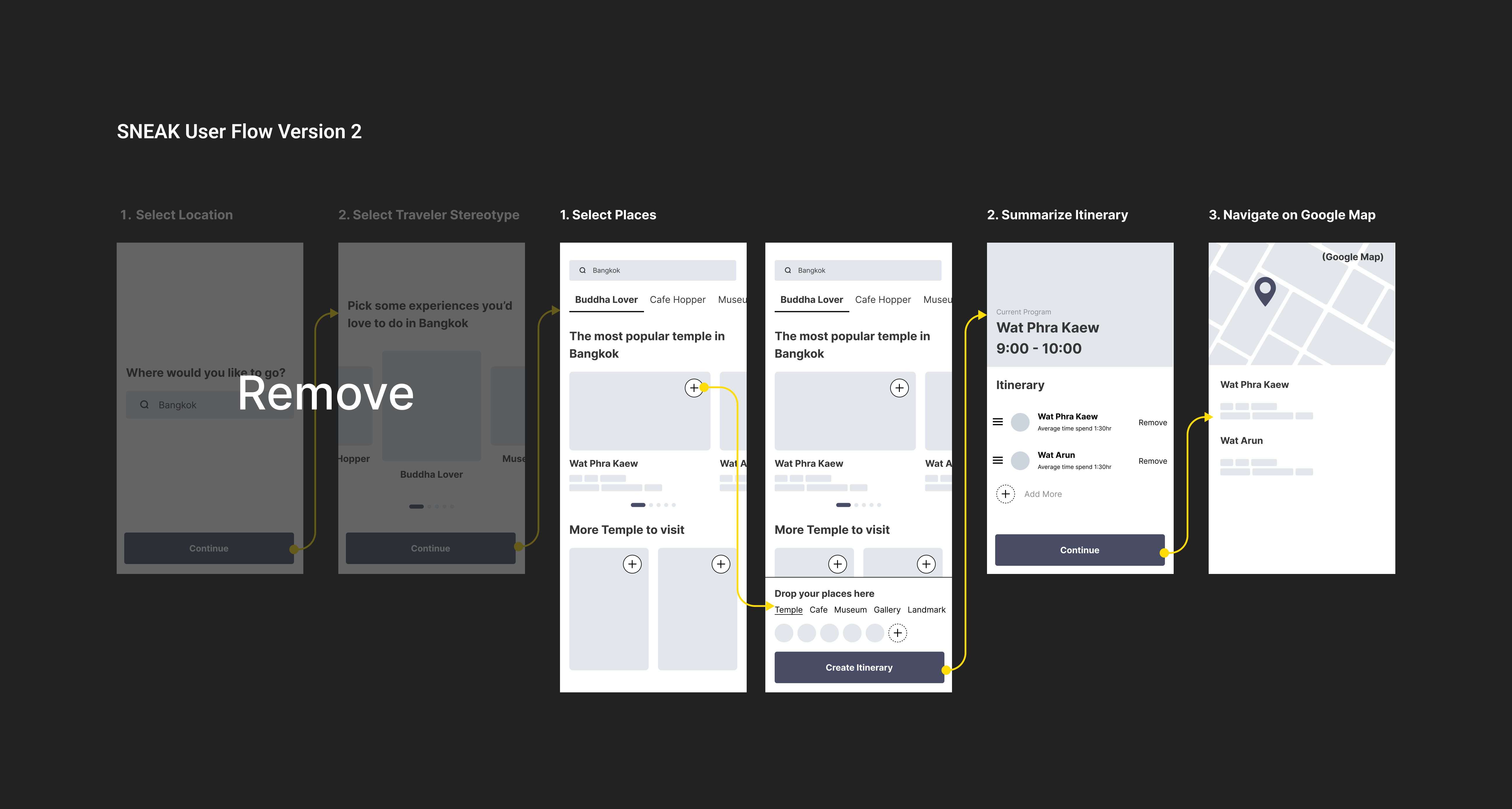
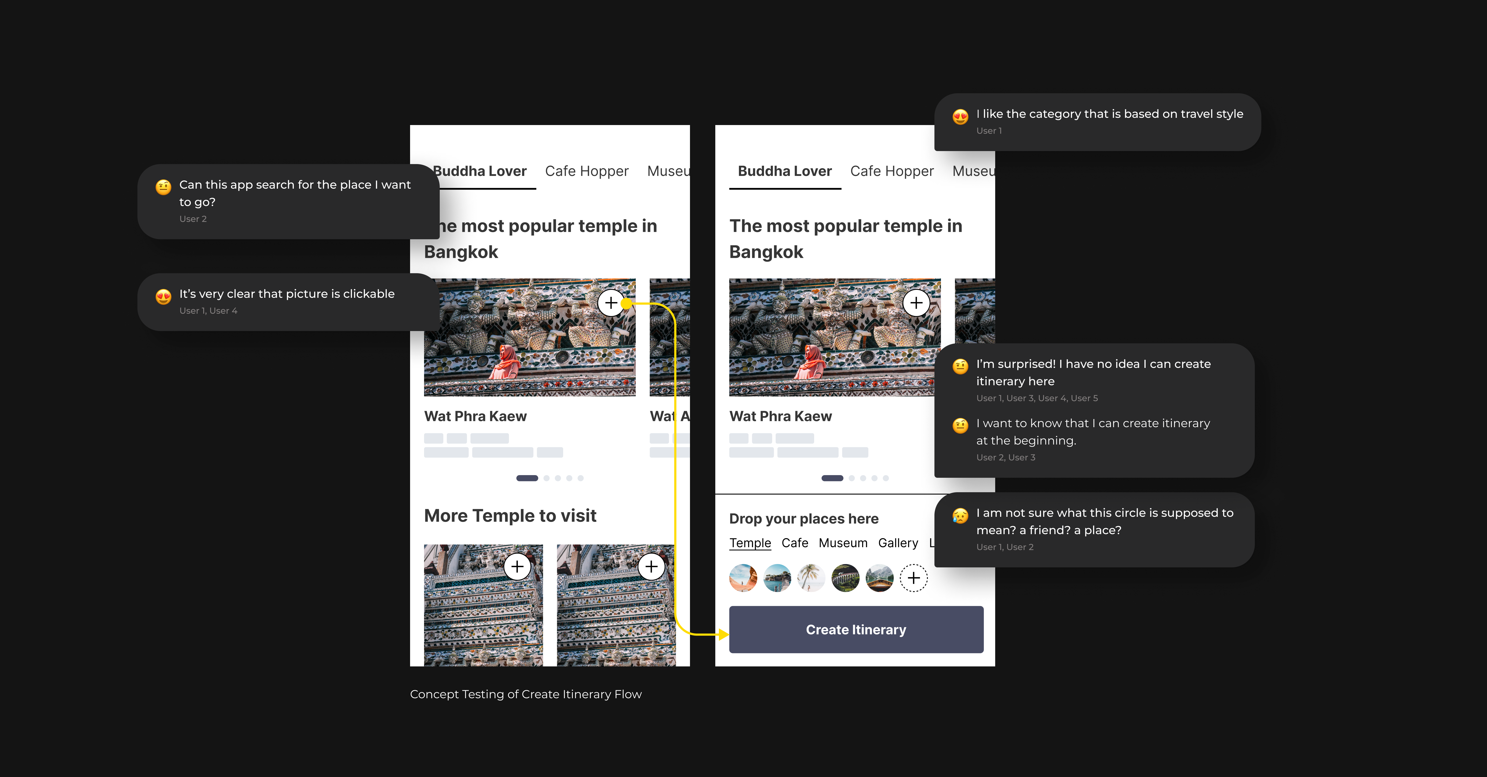
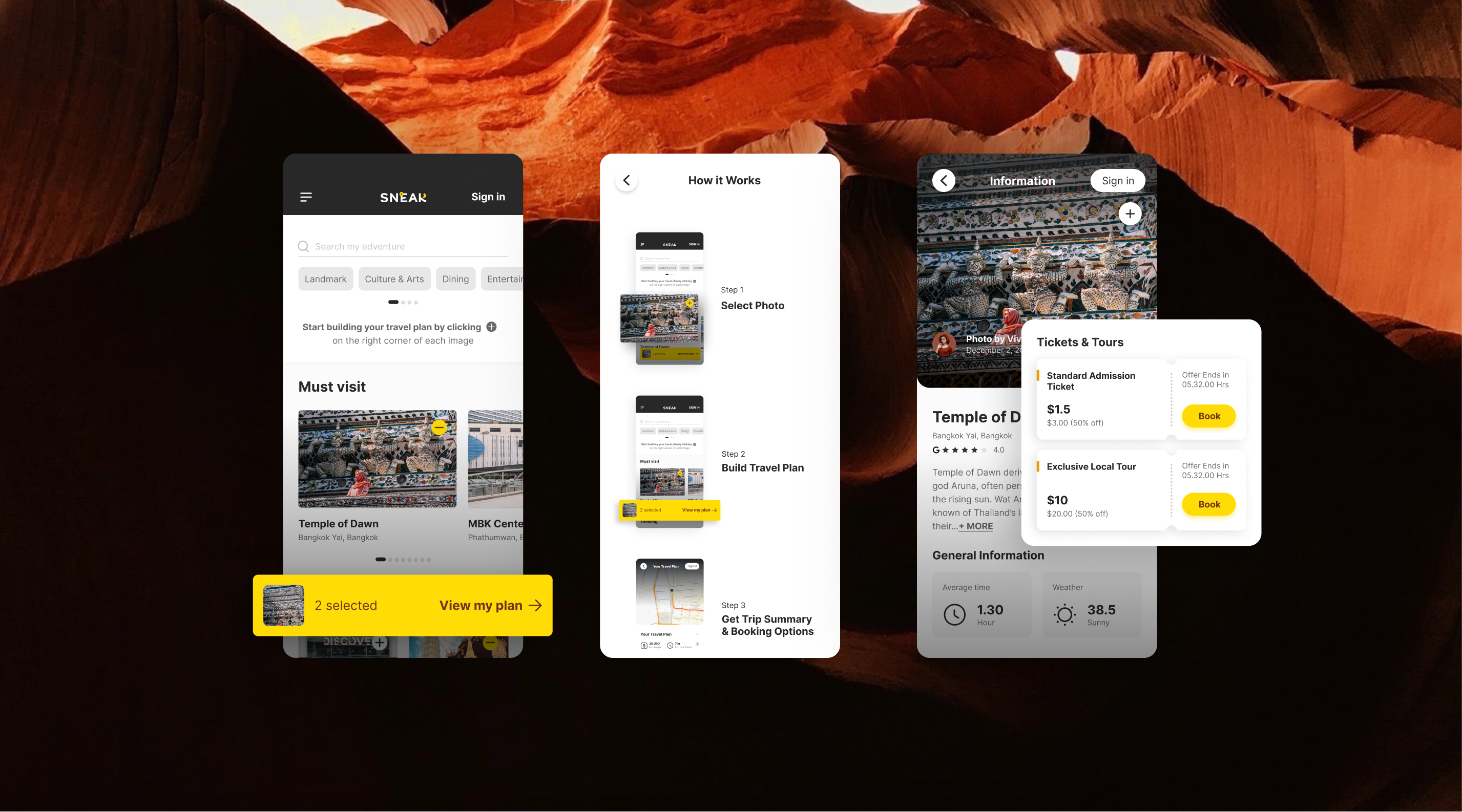
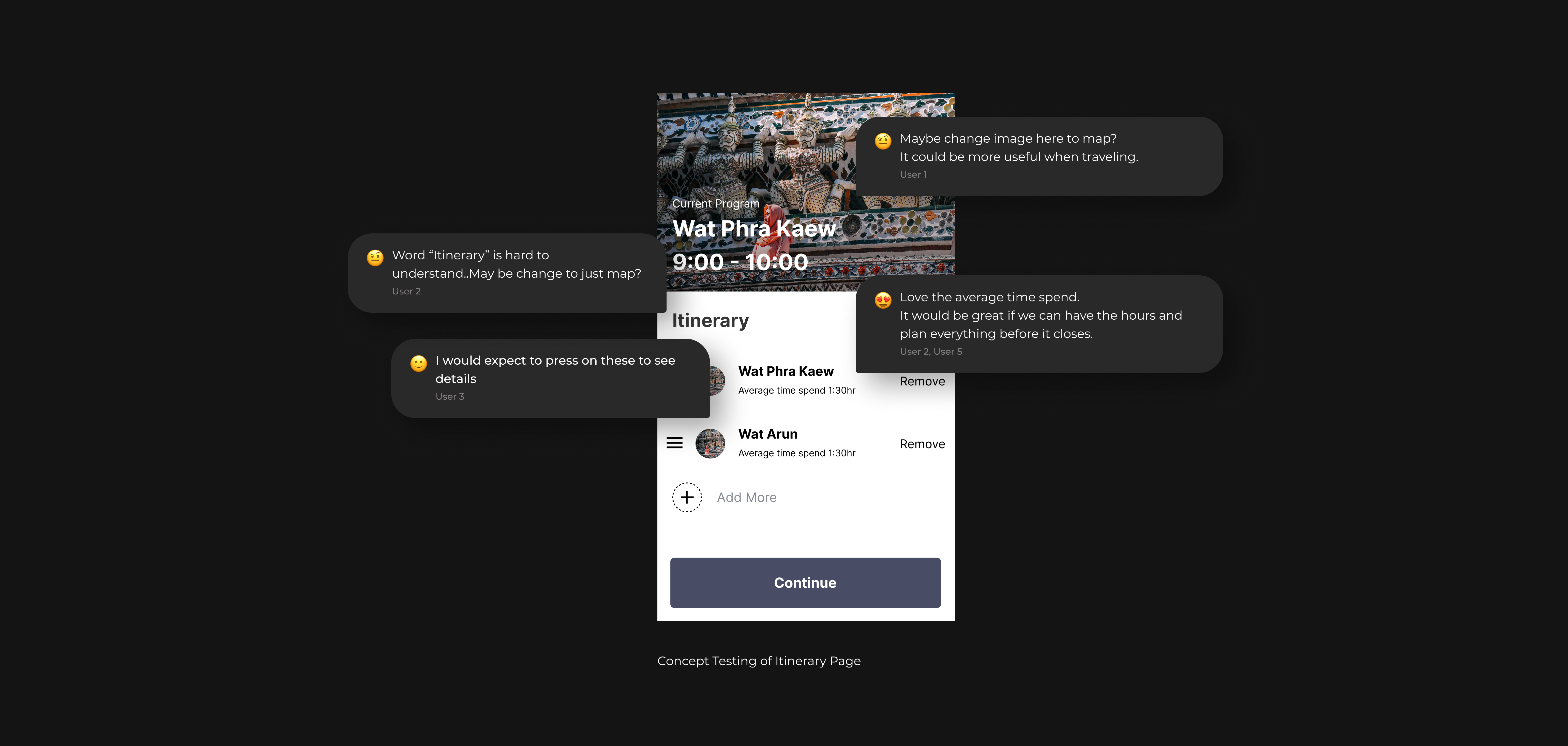
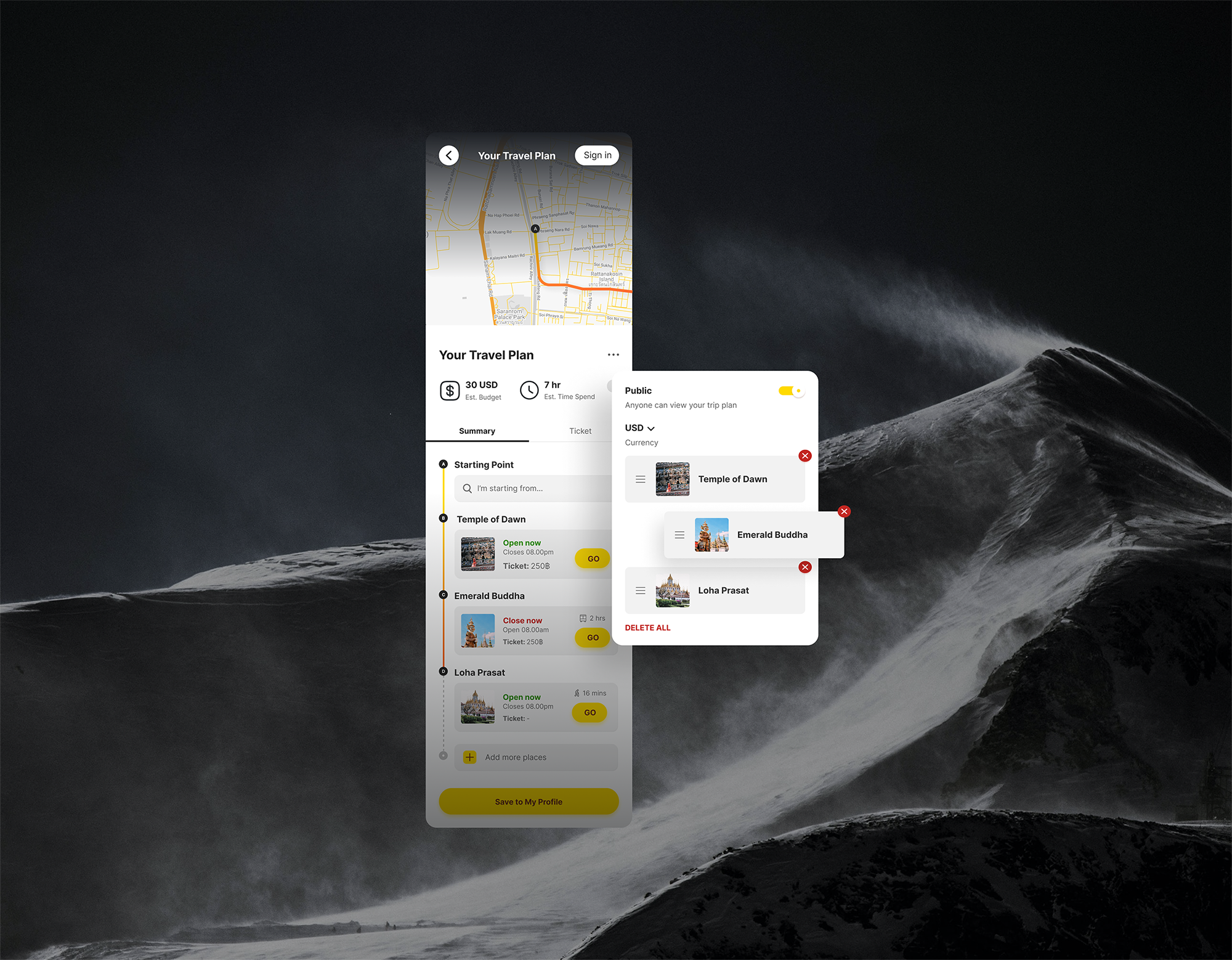
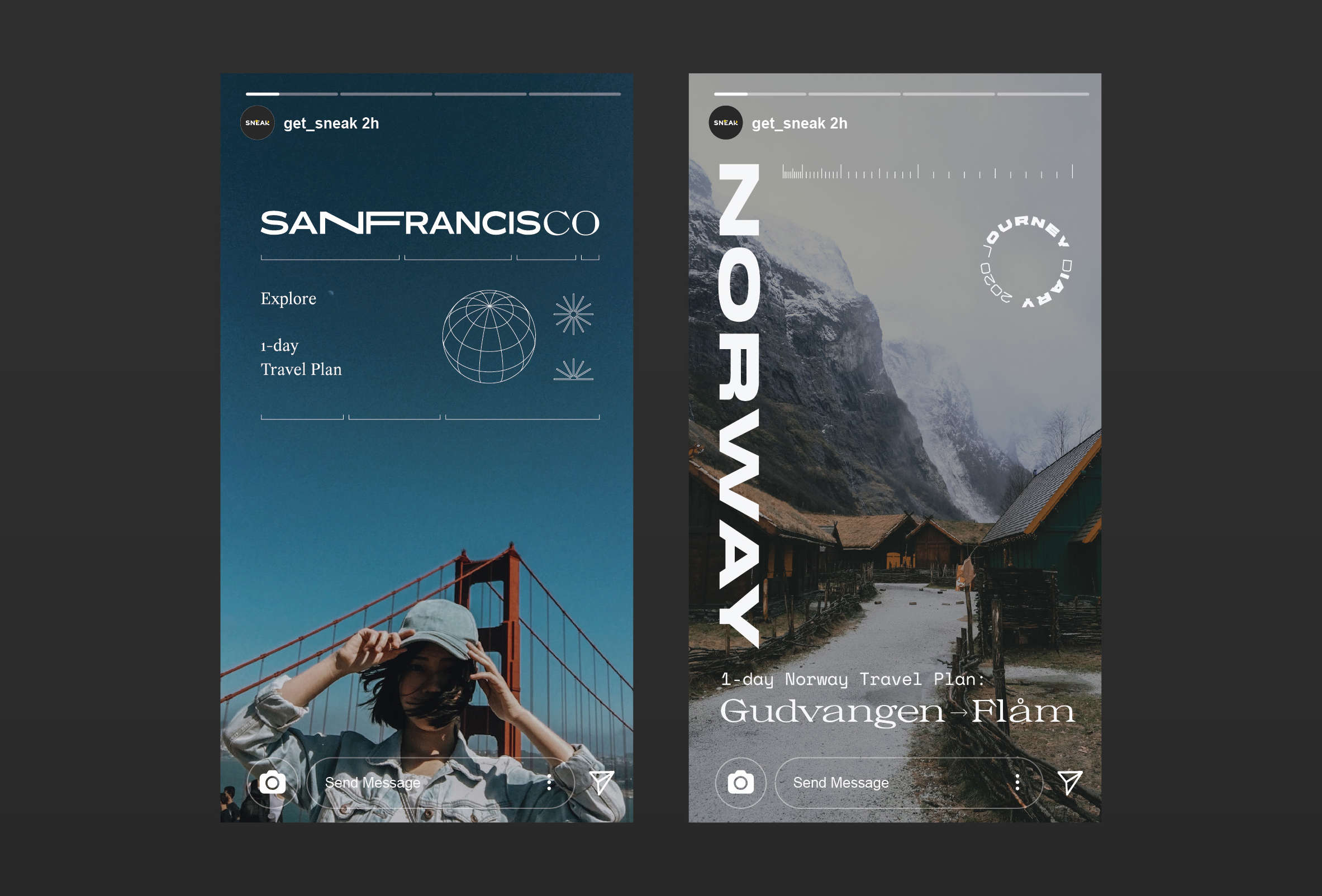
SNEAK is a web application platform that aims to simplify the trip planning experience. During the project, I lead Visual Design team and help establish the platform by working together with UX Designer and Founders.
services
Branding
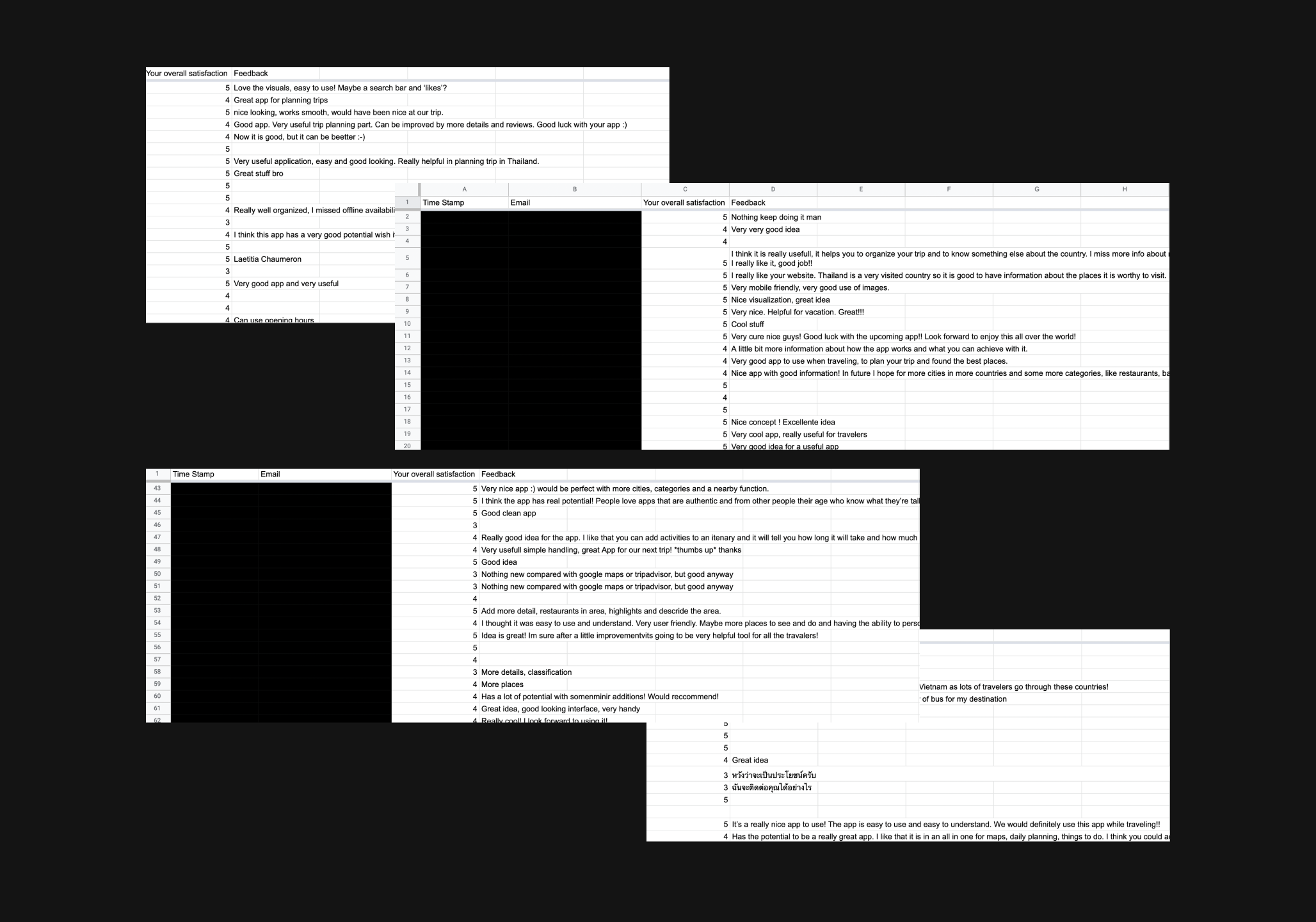
UX Research
Wireframe
UX/UI Design
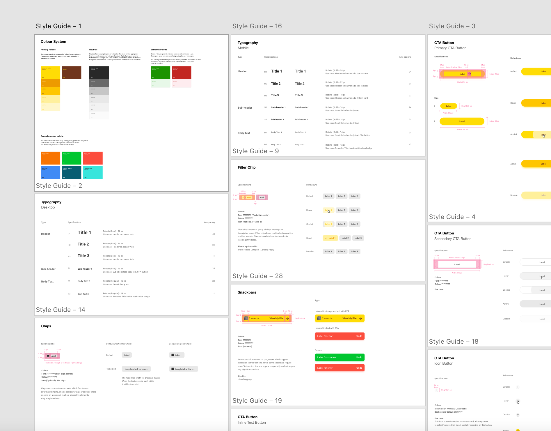
Style Guide
role
Lead Visual Designer (Branding/UI)
Client
GET SNEAK Co., td.
Awards
— 2018 Y Combinator Startup School Graduate
— 2019 TOP100 APAC2019 Top 7 Finalists of AEON Open Innovation Contest (Startup Edition)
— 2019 Top 15 Finalists of dtac Accelerate Batch 7
— 2019 Partner with Tourism Authority of Thailand, Stockholm Office
— 2019 1st Place at Thailand's MICE Startup by TCEB and ImpacTech