ToGoBOX:
Revamp USA Food-tech Start-up Website
Revamp USA Food-tech Start-up Website

Year
2021
overview
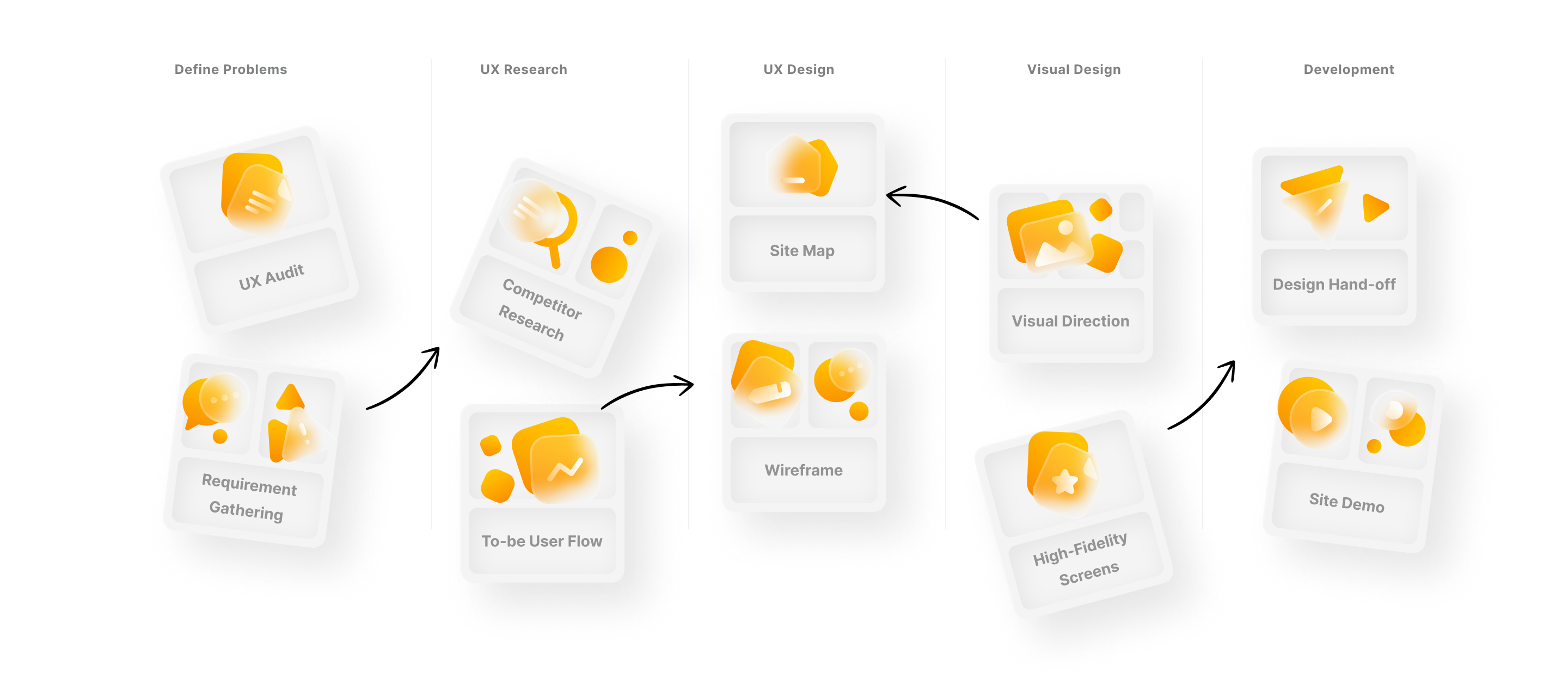
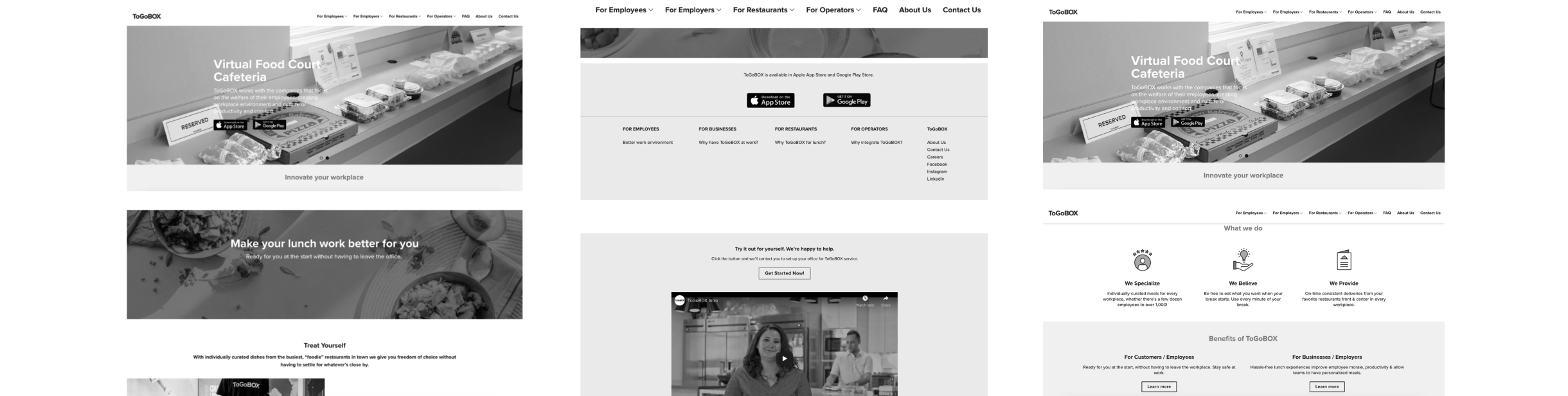
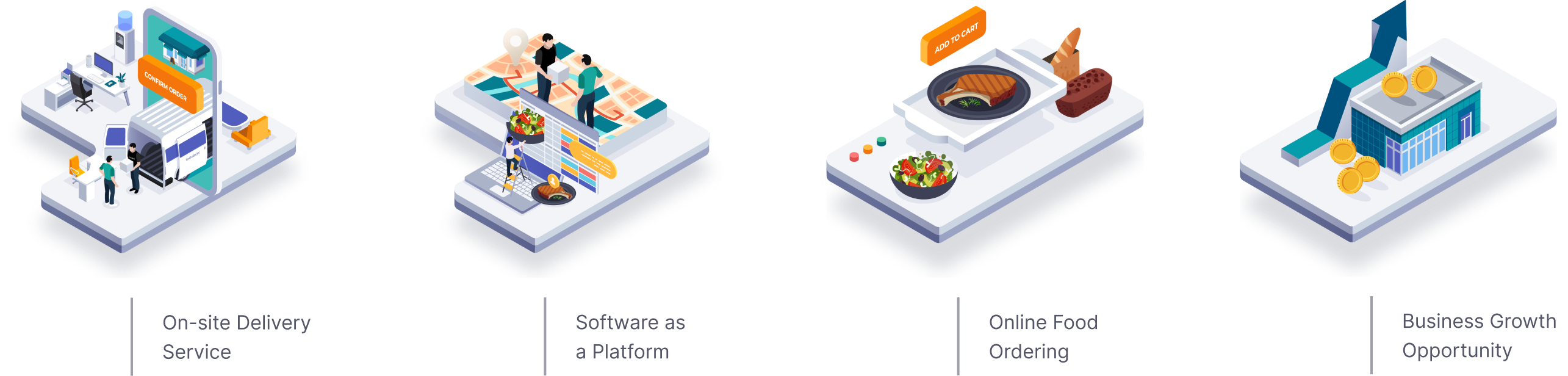
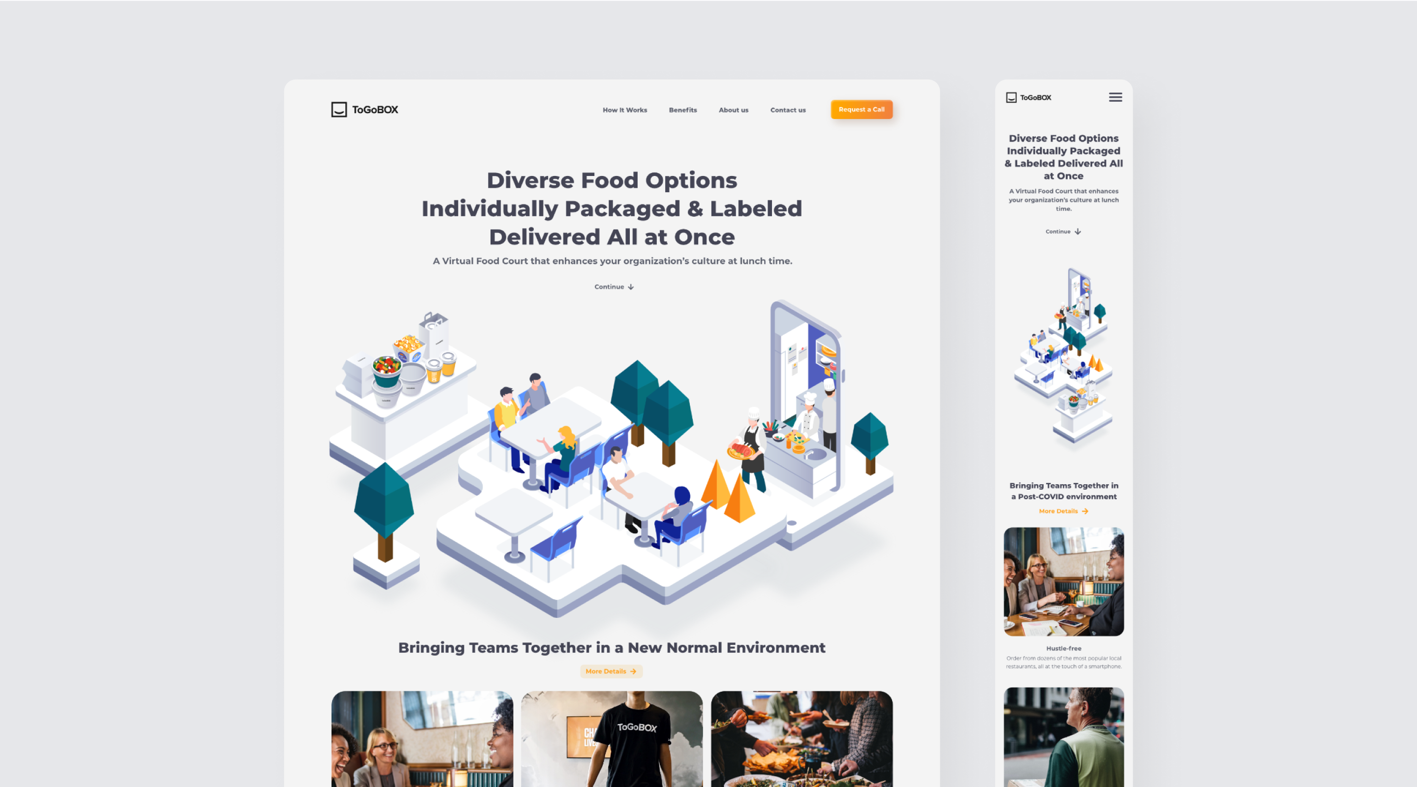
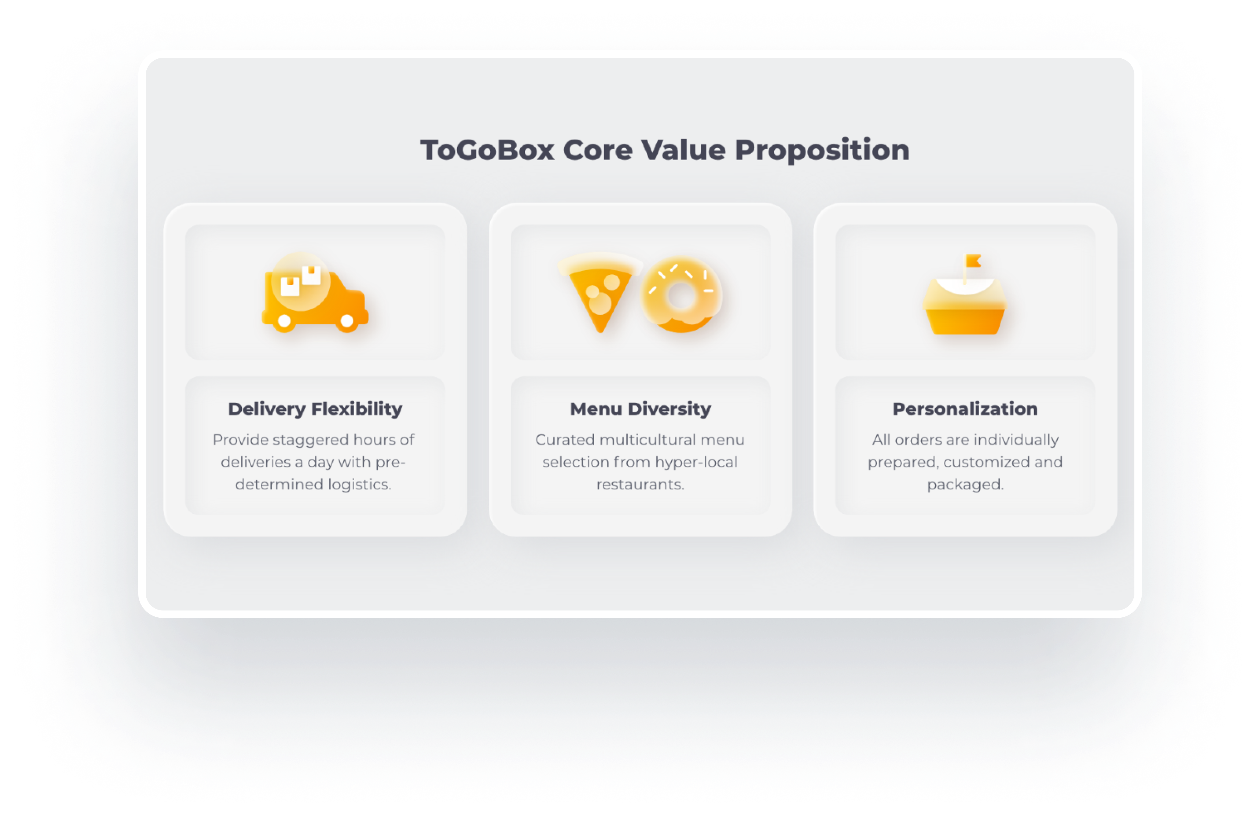
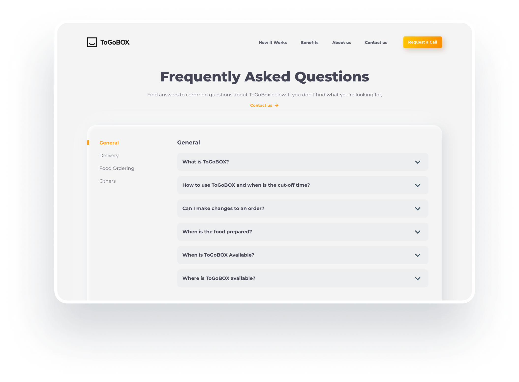
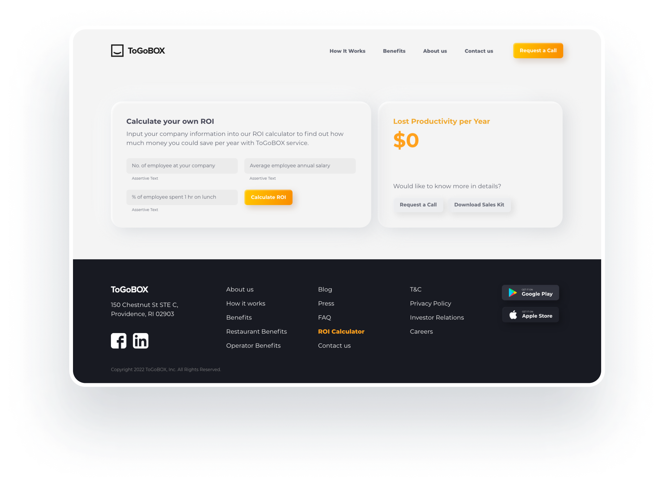
Struggles to communicate through the brand's existing platform, I help ToGoBOX refresh the website's visual interface as well as enhance its browsing experience to better communicate brand and business narratives.
services
UX Audit
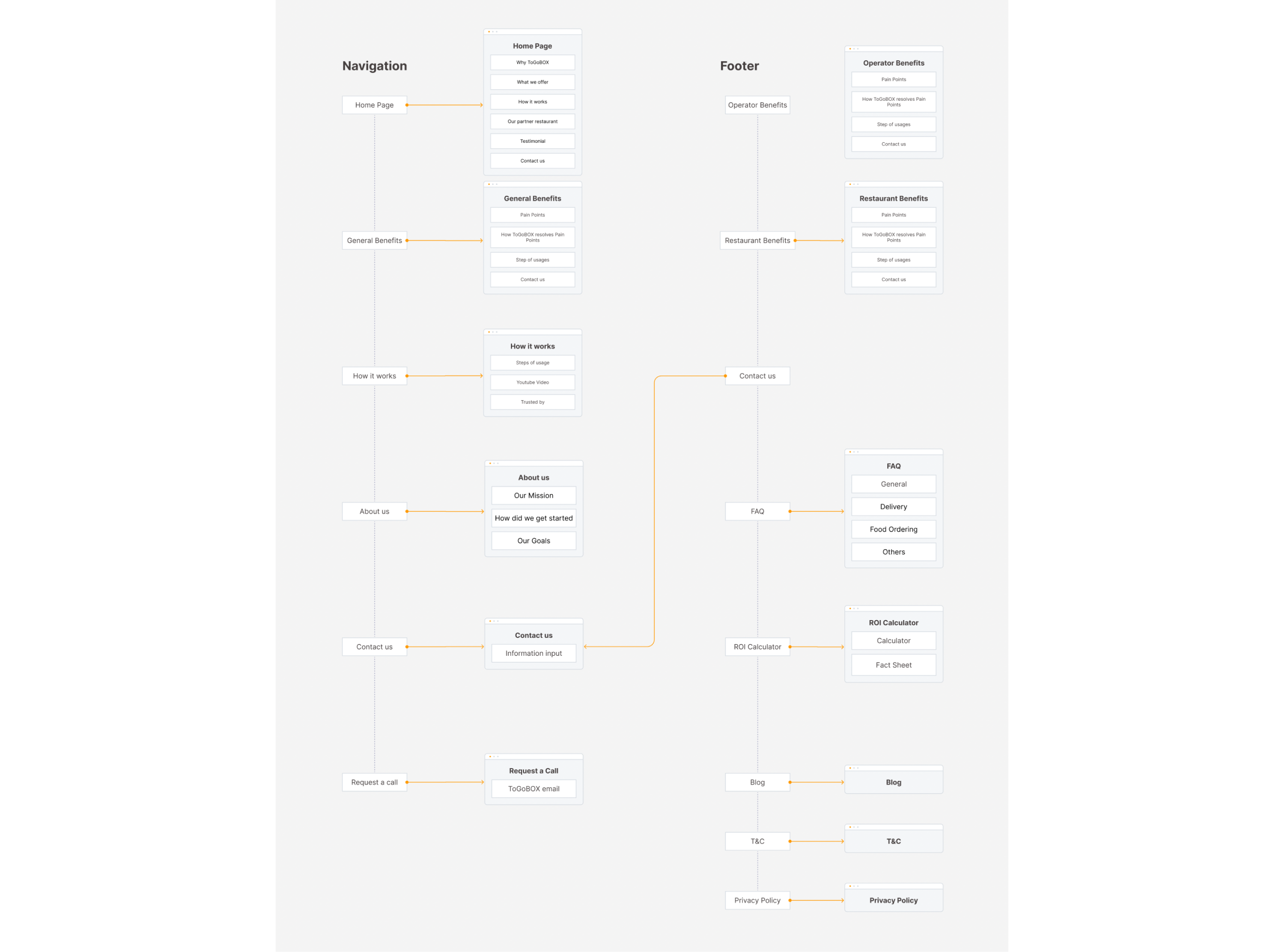
UX Design
Wireframe
Interface Design
client
ToGoBOX, USA
role
UX/UI Designer